HOME — JOURNAL — How the SARA logo was made
PROCESS 2026.10.09 ・ Branding

Translating a ramen chef's craft into a single logo

SARA Craft Ramen & Bar is a craft ramen bar in Melbourne, and its second venue, SARA Ramen & Yakitori Bar, is now open too. The precision of a chef who works closely with wheat, and the quiet balance of a good broth: I wanted to carry that handmade sensibility into an identity for a modern dining space. This is a record of how the logo came to be, from the first ideas through to refinement.

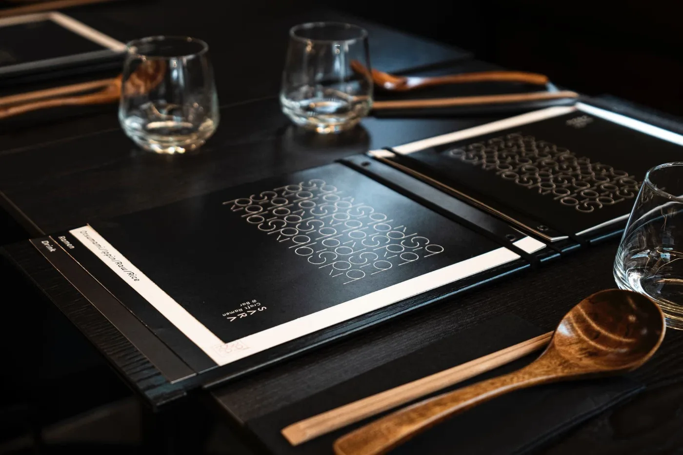
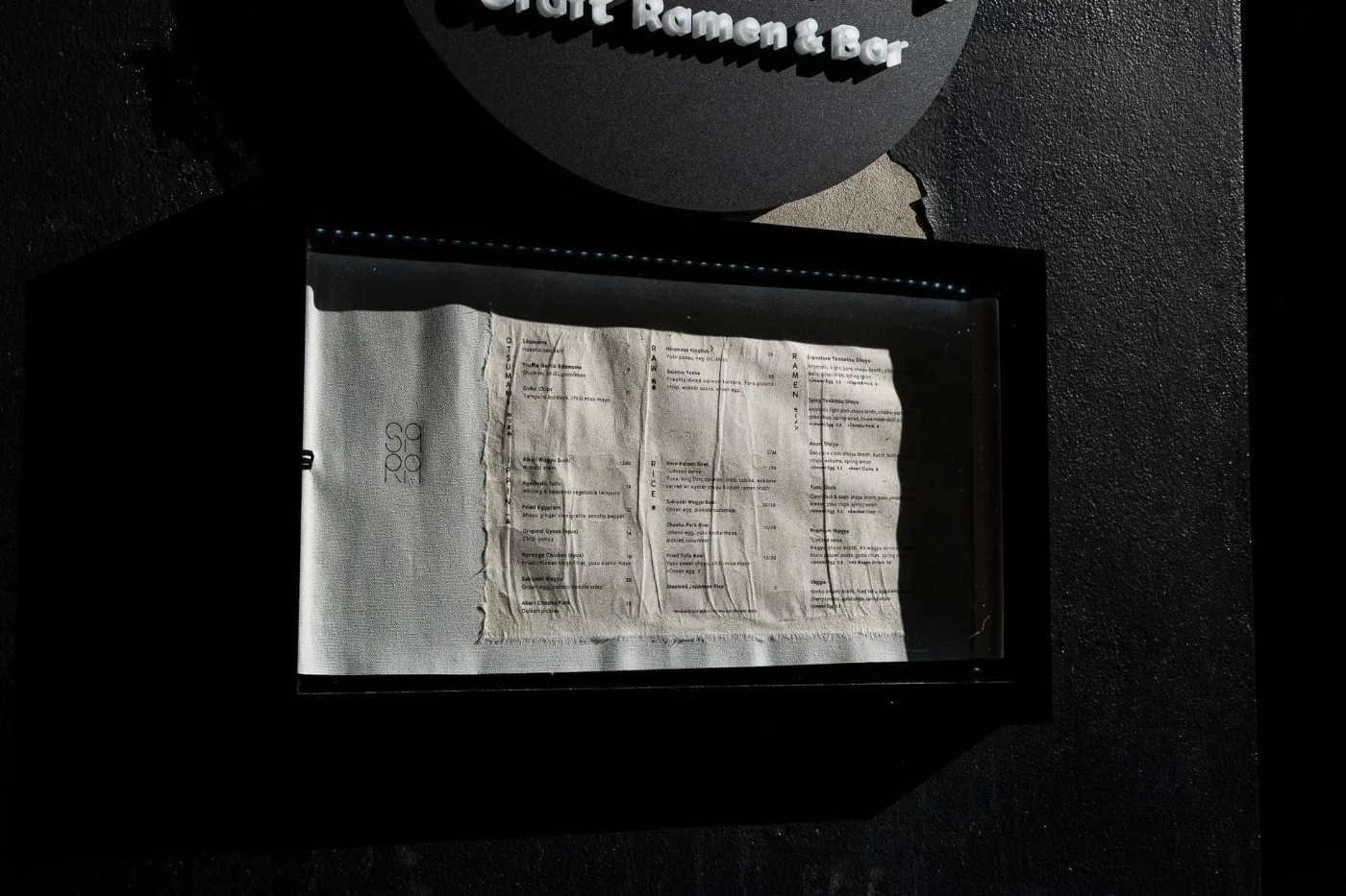
SARA Craft Ramen & Bar menu
The foil-stamped menu. The logo's repeat pattern becomes something you can feel under your fingers.
CONCEPT The idea

The handcraft of Japanese ramen chefs: the precision of working with wheat, and the quiet balance of an authentic bowl. The aim was to translate that into a modern dining experience in Melbourne, respecting tradition while shaping it into a refined, contemporary visual language.

01 ・ IDEAS

First, sketch a lot and go wide.

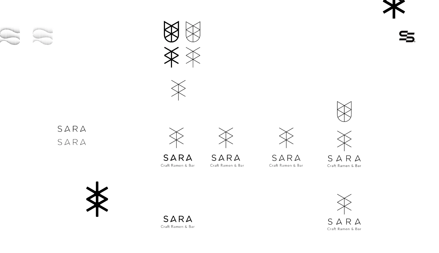
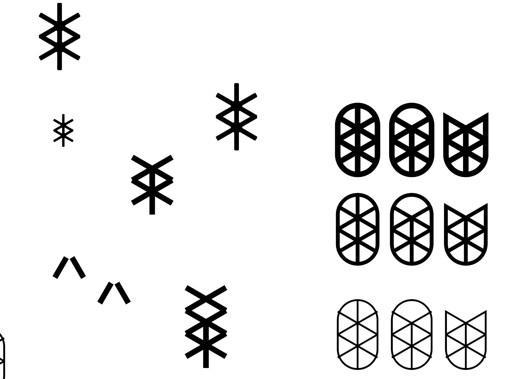
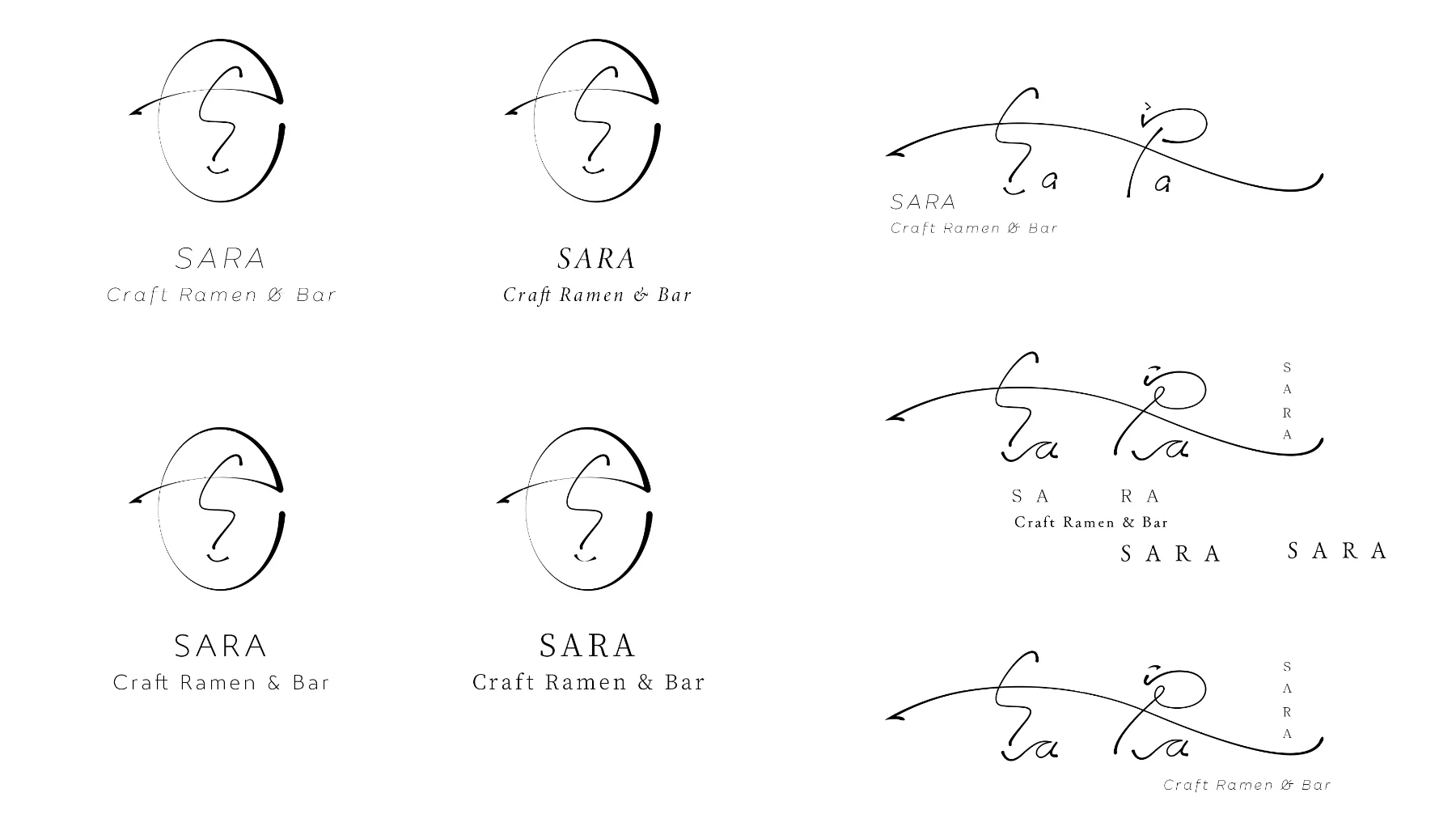
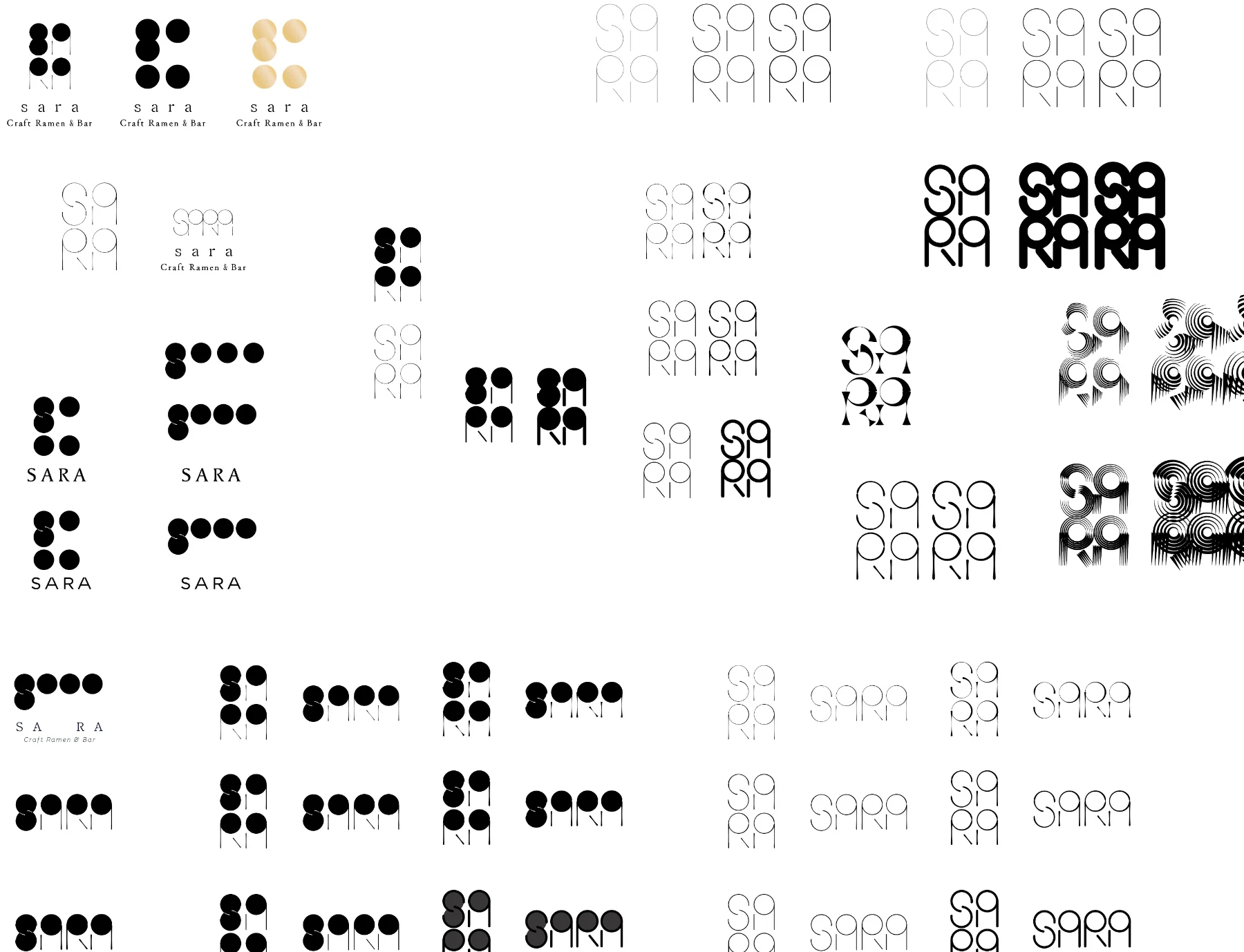
Before cutting back and tidying up, I spread out and drew freely, and explored whether the English "SARA" and the Japanese さら (sara) could be expressed together. It is a ramen shop, but it is also a bar, and I wanted a modern feel, so I aimed for a logo that was simple and memorable.

SARA logo idea sketches (geometric symbols)
Variations on the SARA symbol
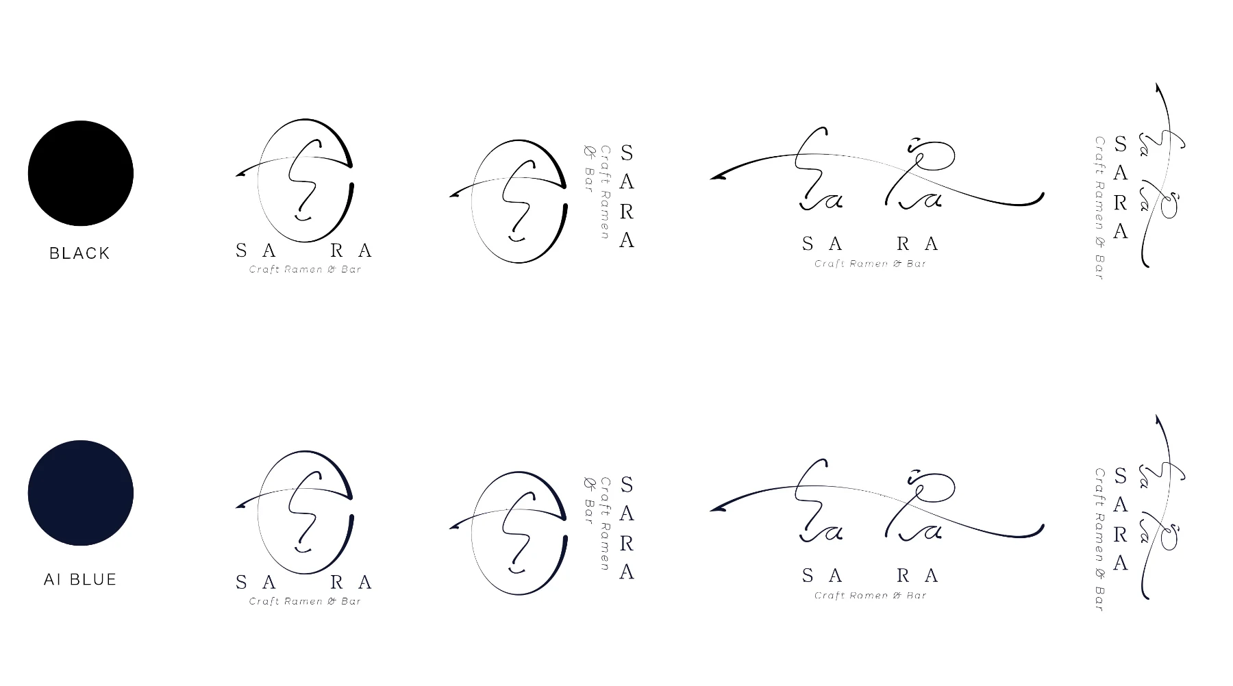
Exploring a hand-drawn style SARA logo
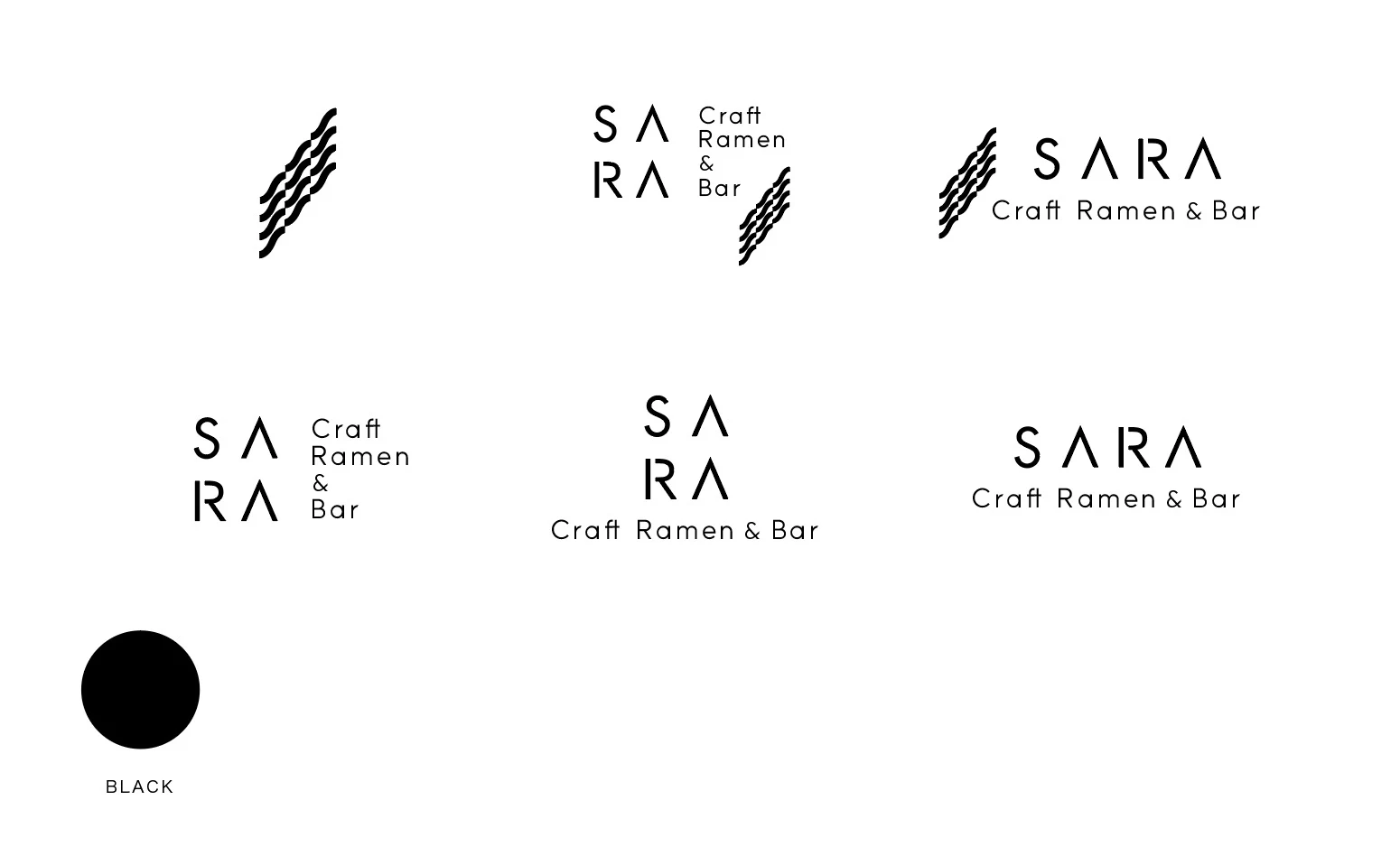
SARA logo option (wave)
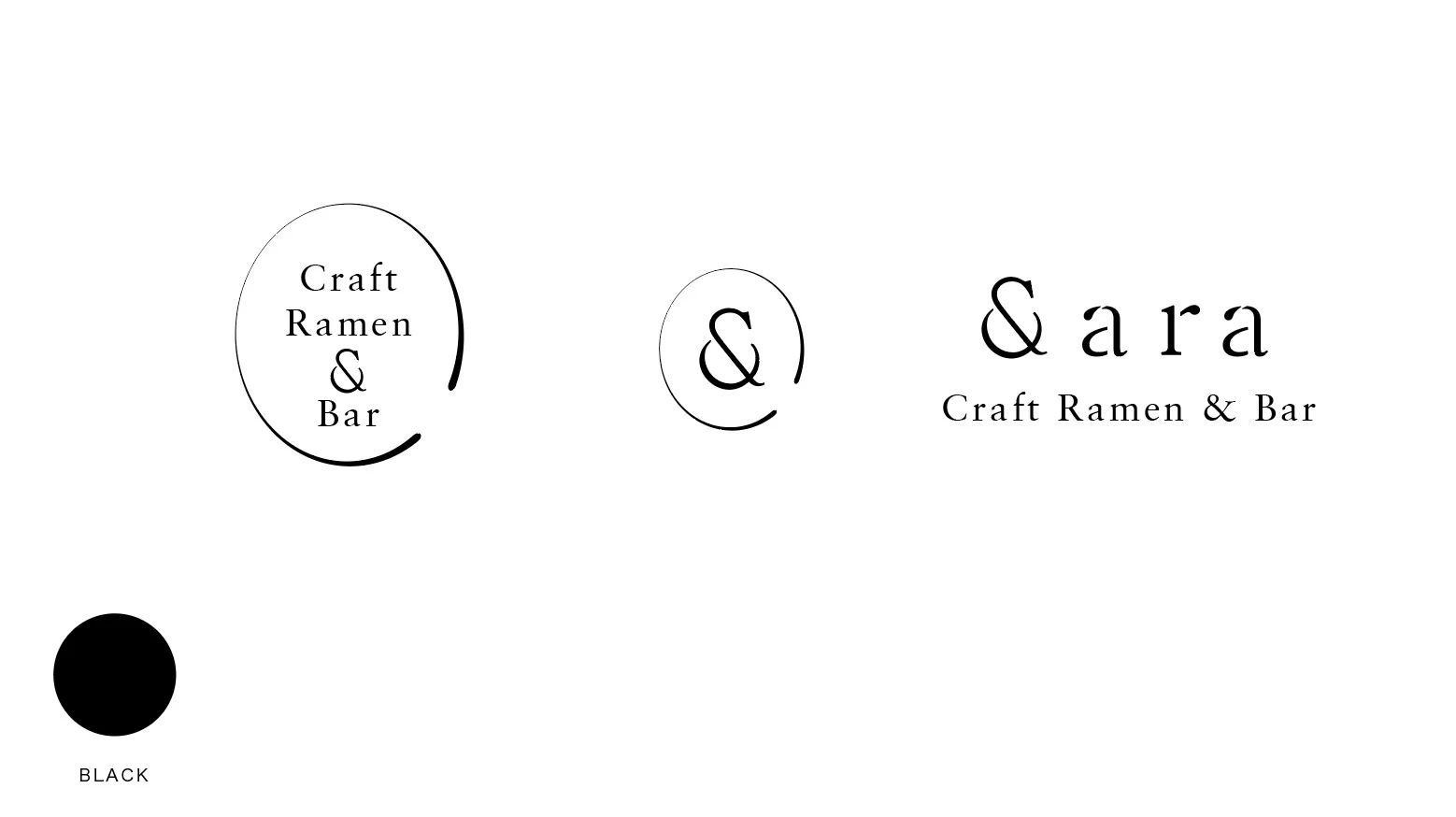
SARA logo option (&ara)
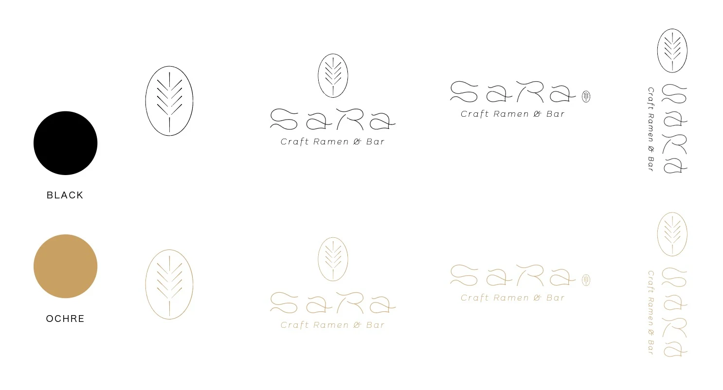
SARA logo option (leaf)
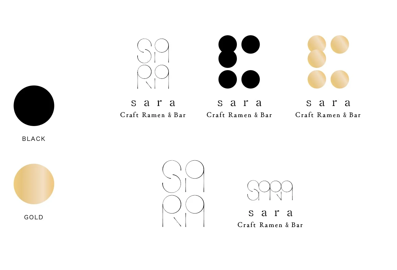
SARA logo option (circle)
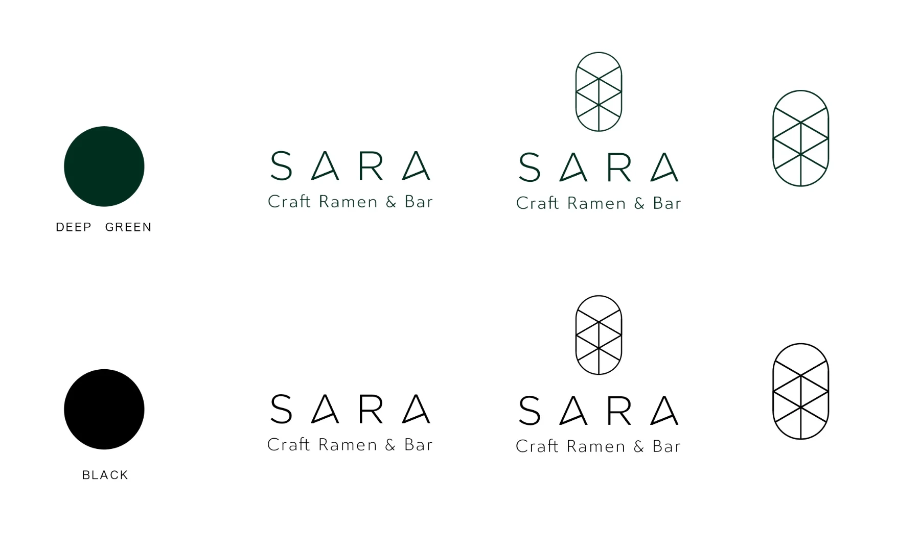
SARA logo option (deep green)
SARA logo option (hand-drawn)
02 ・ BRUSH UP

Cut back, refine, and bring it down to one.

I narrowed down the ideas, adjusting stroke weight, letter spacing and composition millimetre by millimetre. I tested how dense the repeat should be as it rises from dots into letters, and where to draw the line between "you can read it" and "it looks like a pattern". That one point is where I spent most of my time. The result is a flexible wordmark: up close it reads as letters, and from a distance it becomes texture.

Refining the SARA wordmark
03 ・ EXECUTION

Carrying the brand all the way to things you can hold.

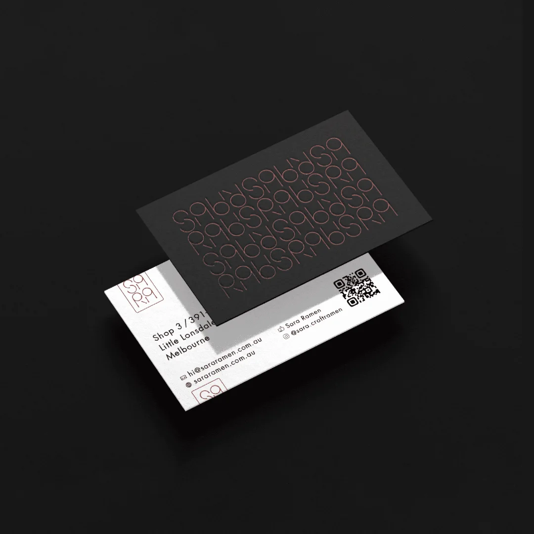
Signage, business cards, menus and the website. One pattern flows consistently from foil stamping on paper to the signs inside the restaurant. With black as the base, copper foil, QR codes and photography with plenty of space, I expressed that "quiet balance".

SARA interior and menu
SARA business cards
SARA stationery
SARA brand cards
04 ・ NEW SHOP

The second venue, SARA Ramen & Yakitori Bar, is open.

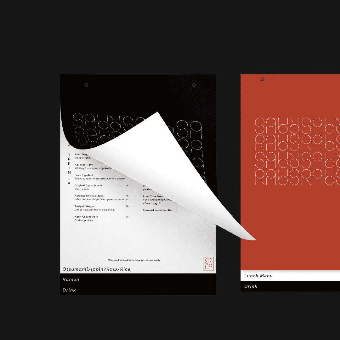
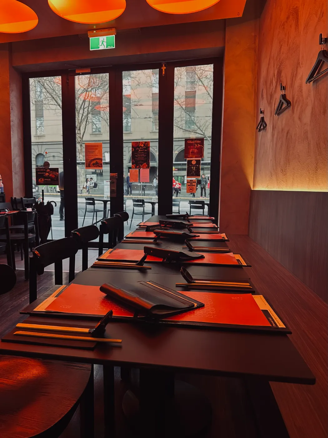
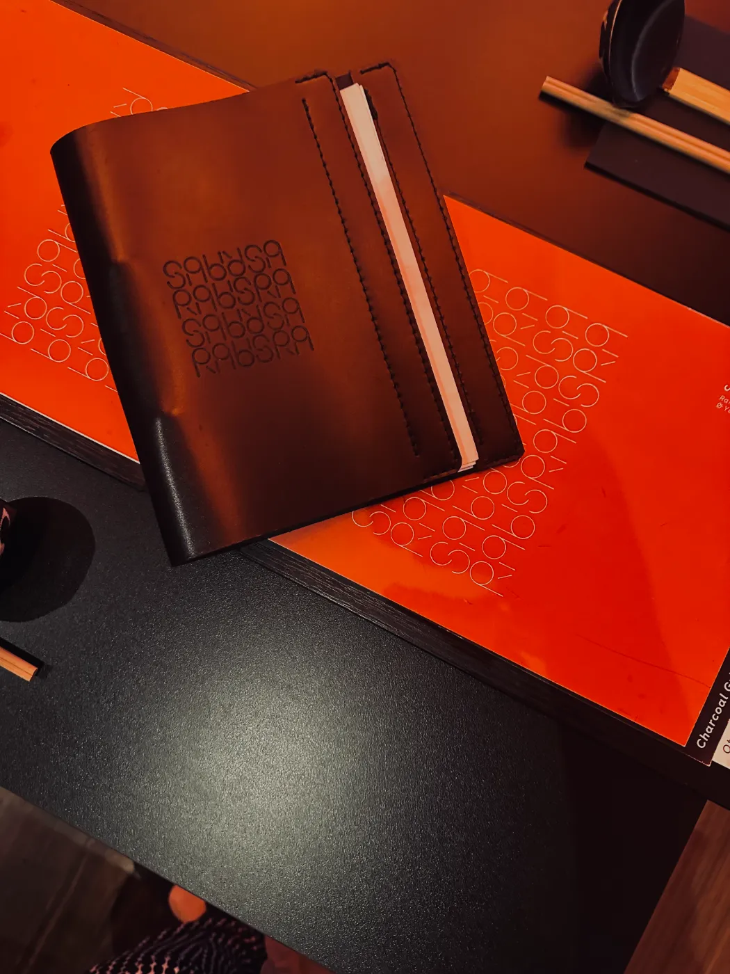
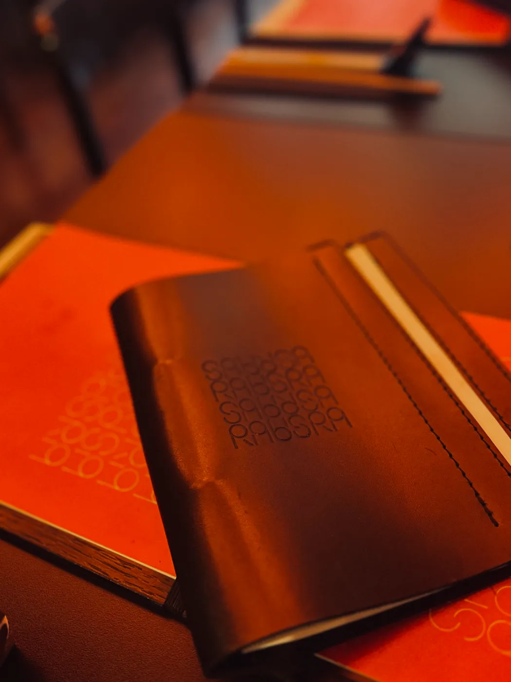
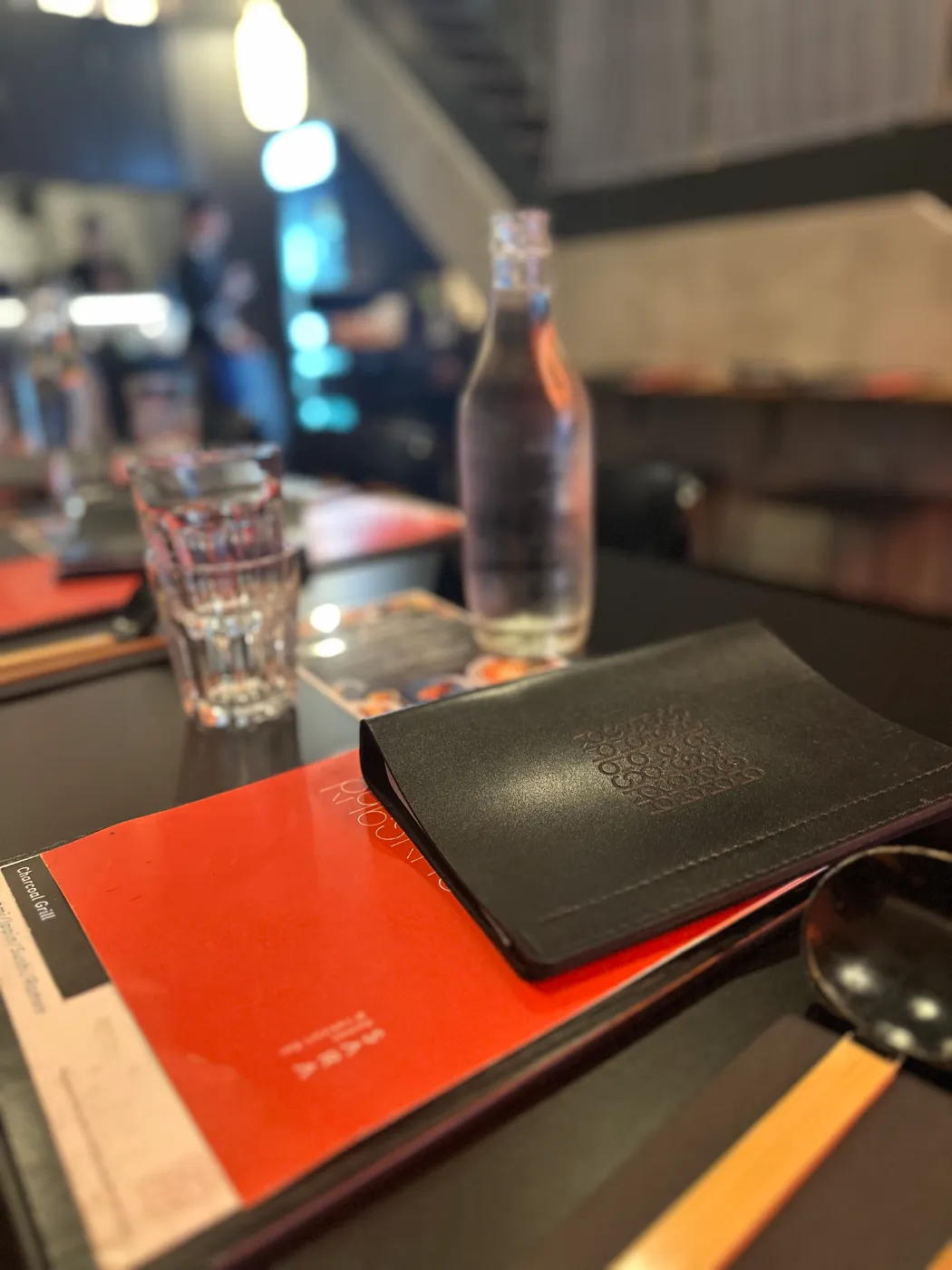
SARA Ramen & Yakitori Bar, the second venue, has opened on Bourke Street in Melbourne. Alongside ramen, you can enjoy yakitori here too. The same pattern appears embossed on the leather menu covers and in fine lines on the orange menu sheets.
Inside SARA Ramen & Yakitori Bar
Embossed leather menu cover
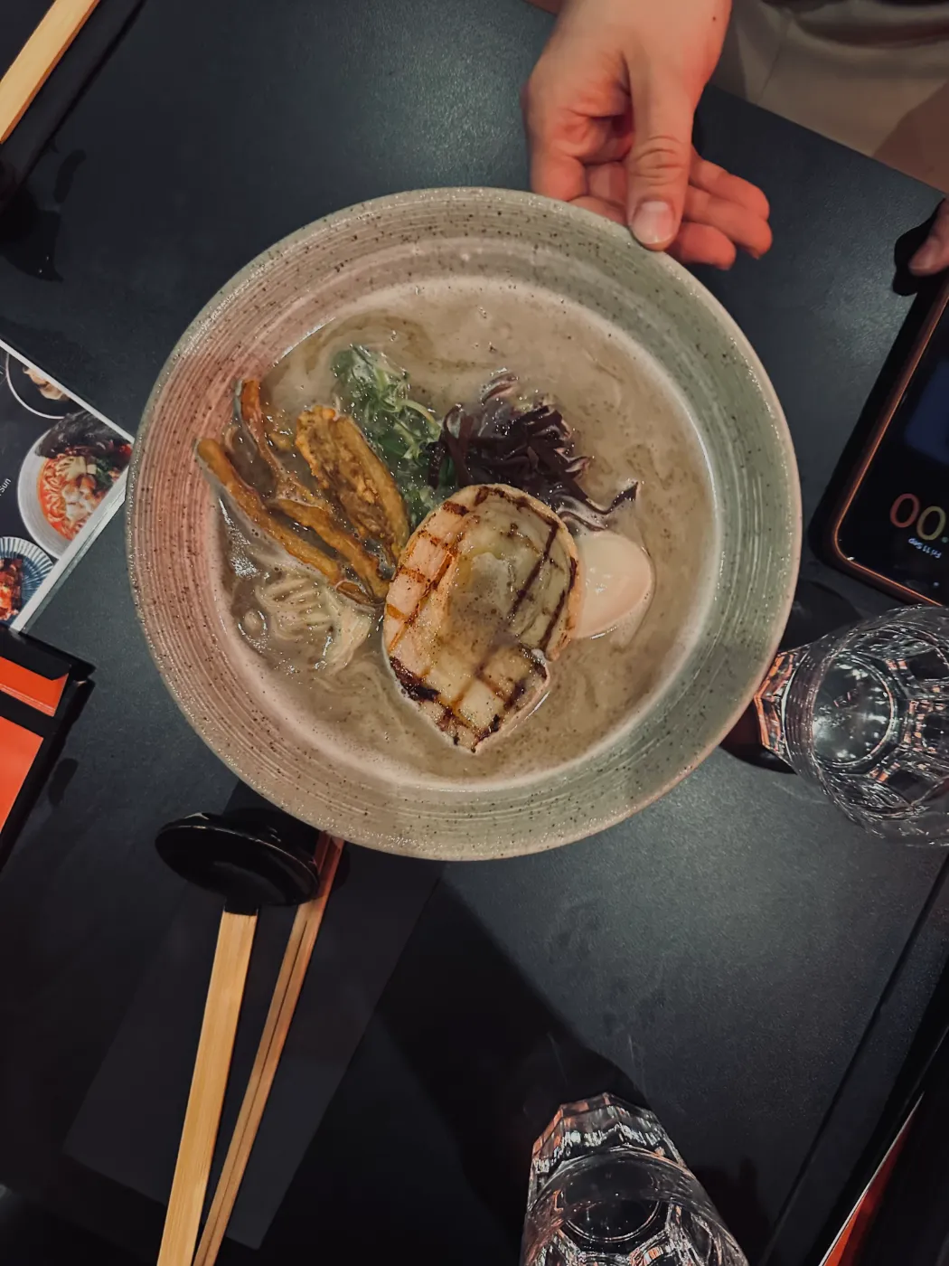
Ramen at SARA
The pattern on the menu cover
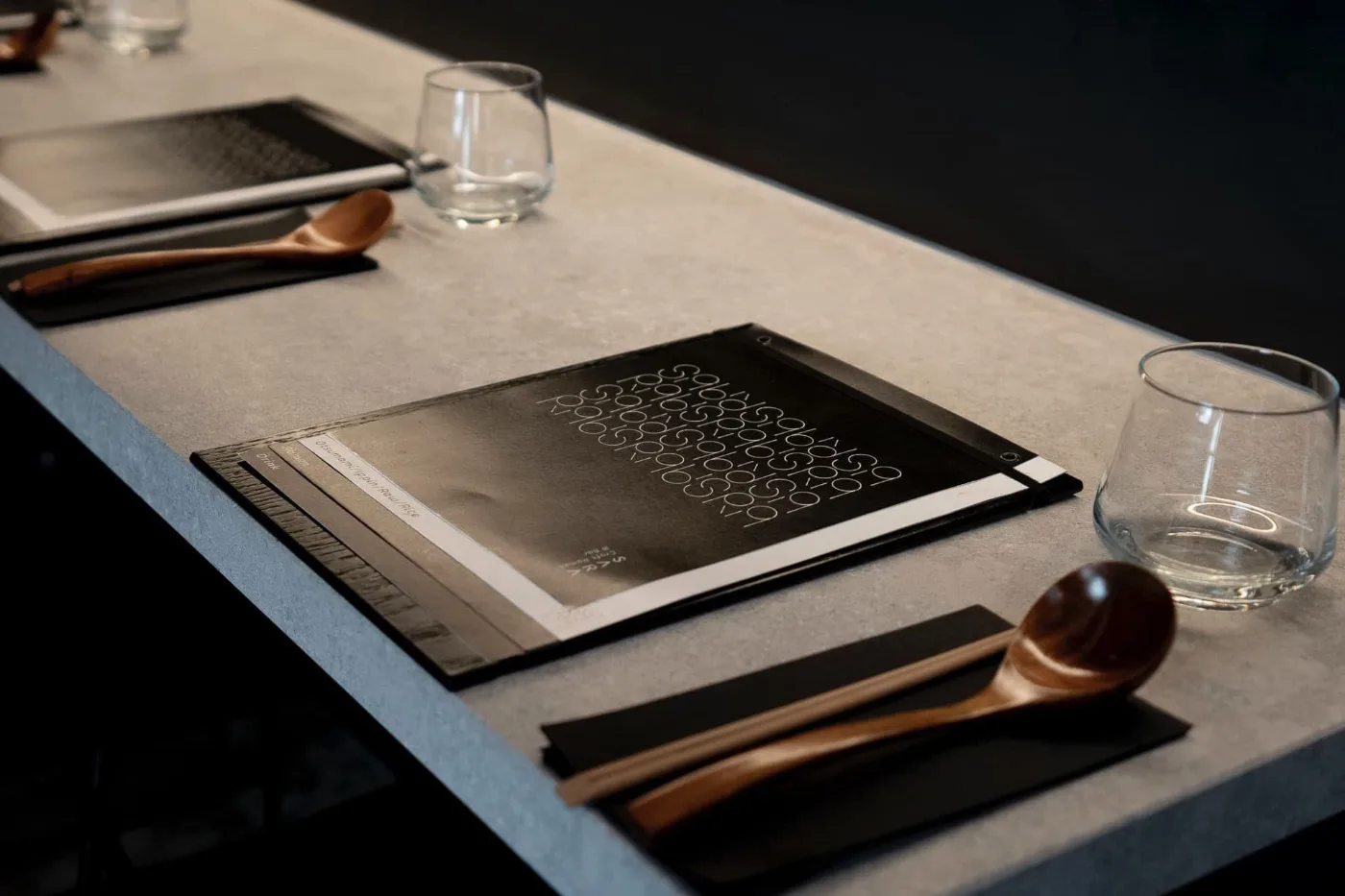
Table setting and menu
VISIT Go and try it
SARA Craft Ramen & Bar
Shop 3/391-393 Little Lonsdale St, Melbourne VIC 3000
Walk-ins only (no bookings)
Open in Google Maps
SARA Ramen & Yakitori Bar NEW
14 Bourke St, Melbourne VIC 3000
Bookings available
Open in Google Maps
RELATED WORK SARA Craft Ramen & Bar project page

See the gallery of the finished logo, website and in-store pieces.
View the project →
FREE CONSULTATION Opening a restaurant, or ready to refresh your brand?

Tell us about your business, in English or Japanese. A link or a few photos is a fine place to start. No pressure.

Get in touch →

Send me an email or DM about your business and ideas or for fun collaboration.

フォームやメール、LINEからお気軽にご相談ください。

オーストラリアで活動されている様々な分野の方からのメッセージやコラボレーションの企画もウェルカムです!