{{ blurb }}
{{ about }}
{{ sp.text }}
{{ pt.body }}
{{ st.body }}

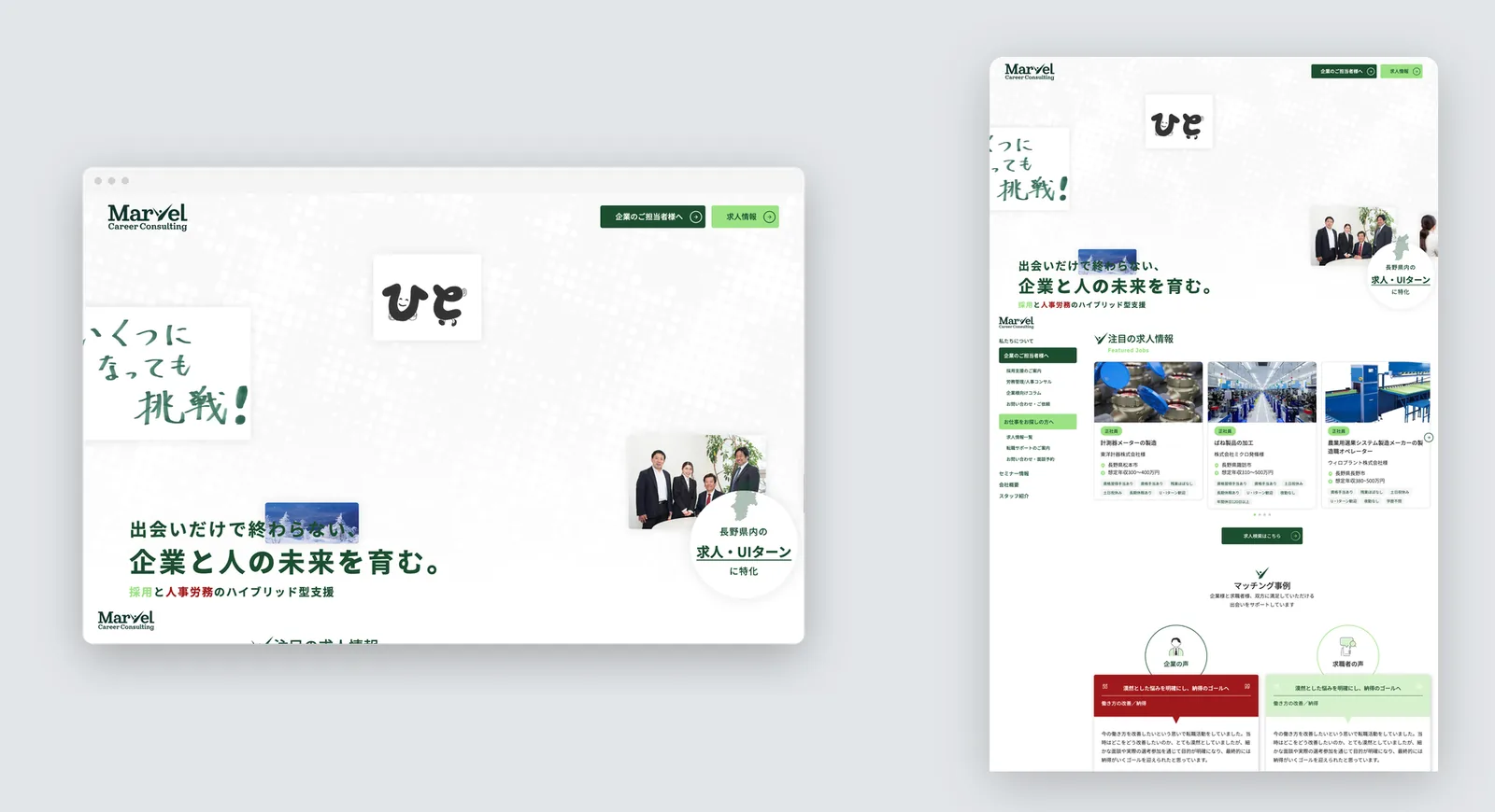
Website design, 3 pages (corporate site)
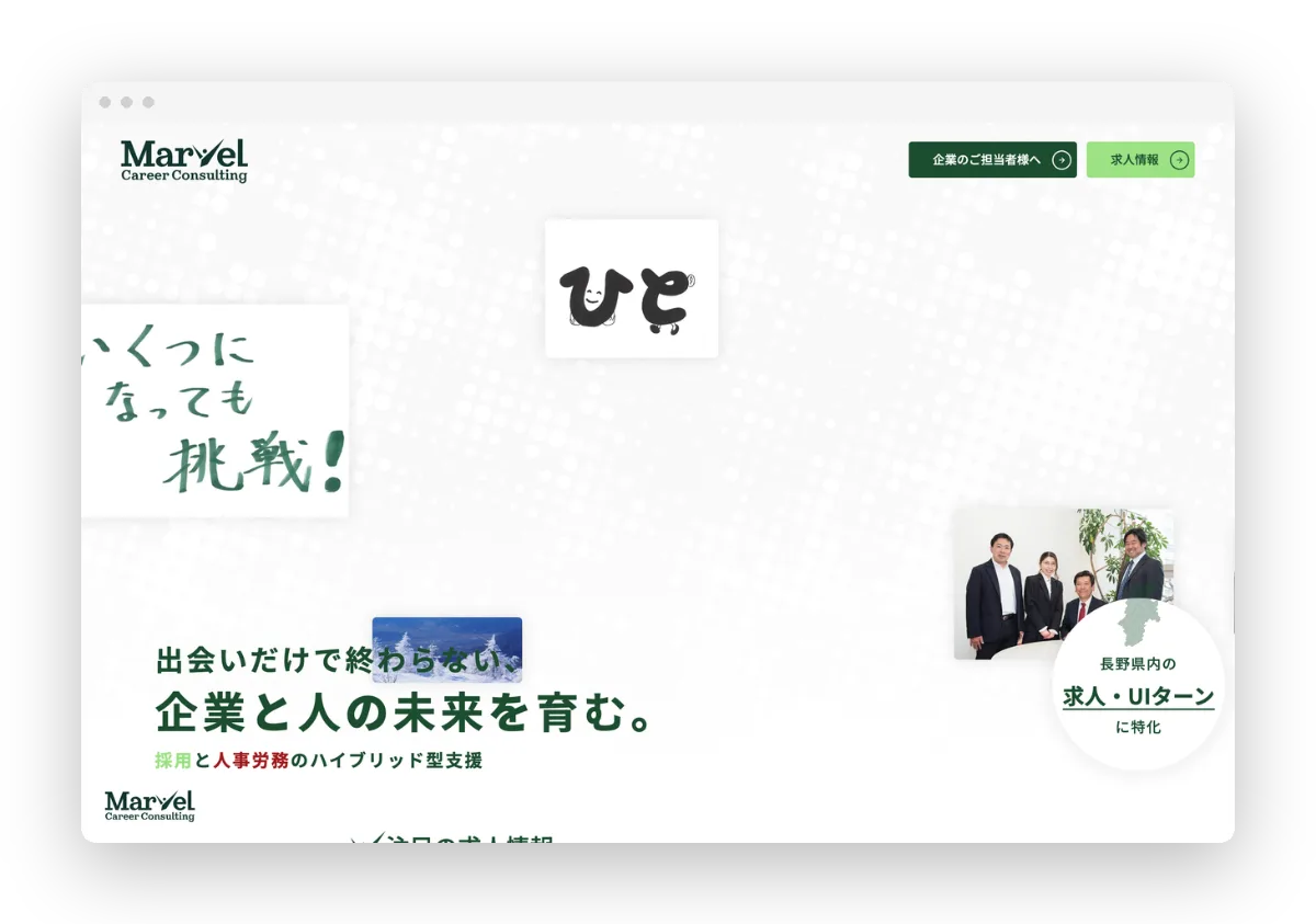
A recruitment company that matches job seekers with employers. It serves both sides, with HR solutions for corporate hiring teams and job listings for candidates. The V in its logo reflects a hope to revive the region through the Suwa and Okaya watchmaking industry.
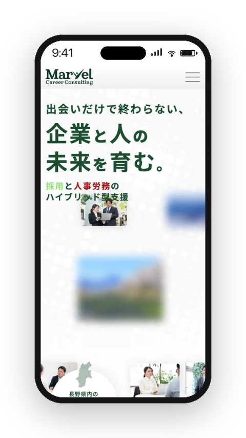
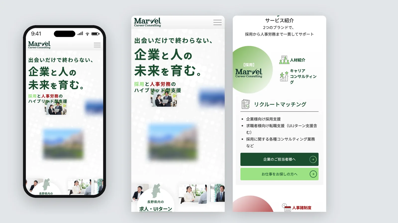
With corporate hiring managers as the main audience, we gave the site a structured, trustworthy tone suited to a business-facing brand, based on green and white.
The V in the logo stands for a clock's hour and minute hands, with a dot for a person's face, and for the Suwa and Okaya watchmaking heritage. We built that story into the triangle graphics used across the site.
A deeper green speaks to corporate clients and a lighter green to job seekers, so each audience gets its own feel within one brand.