{{ blurb }}
{{ about }}
{{ sp.text }}
{{ pt.body }}
{{ st.body }}

Website design (corporate site)
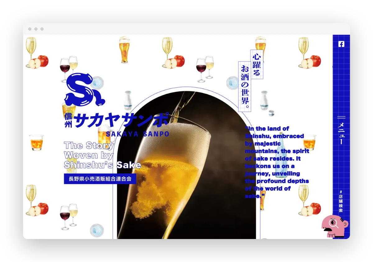
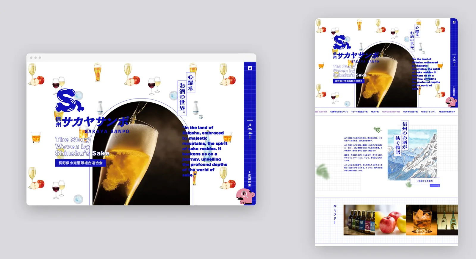
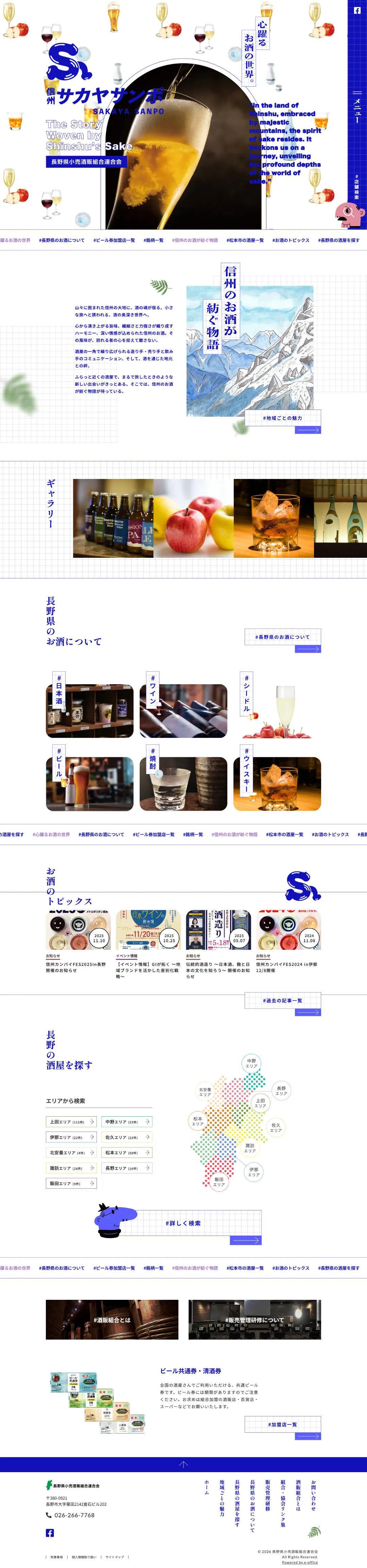
The federation of retail liquor associations in Nagano Prefecture. Its website introduces liquor stores across the prefecture, aiming to energise local shops by encouraging more people to pick up Shinshu sake and other drinks.
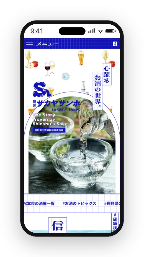
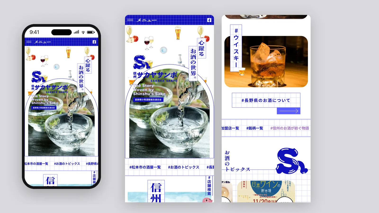
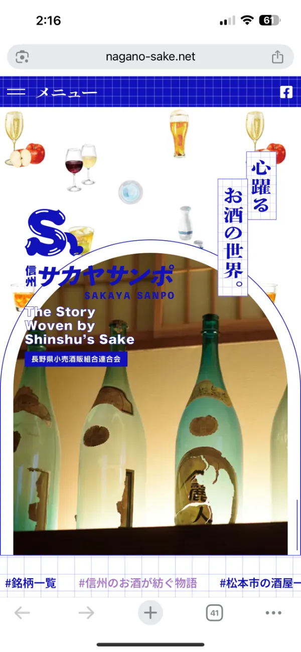
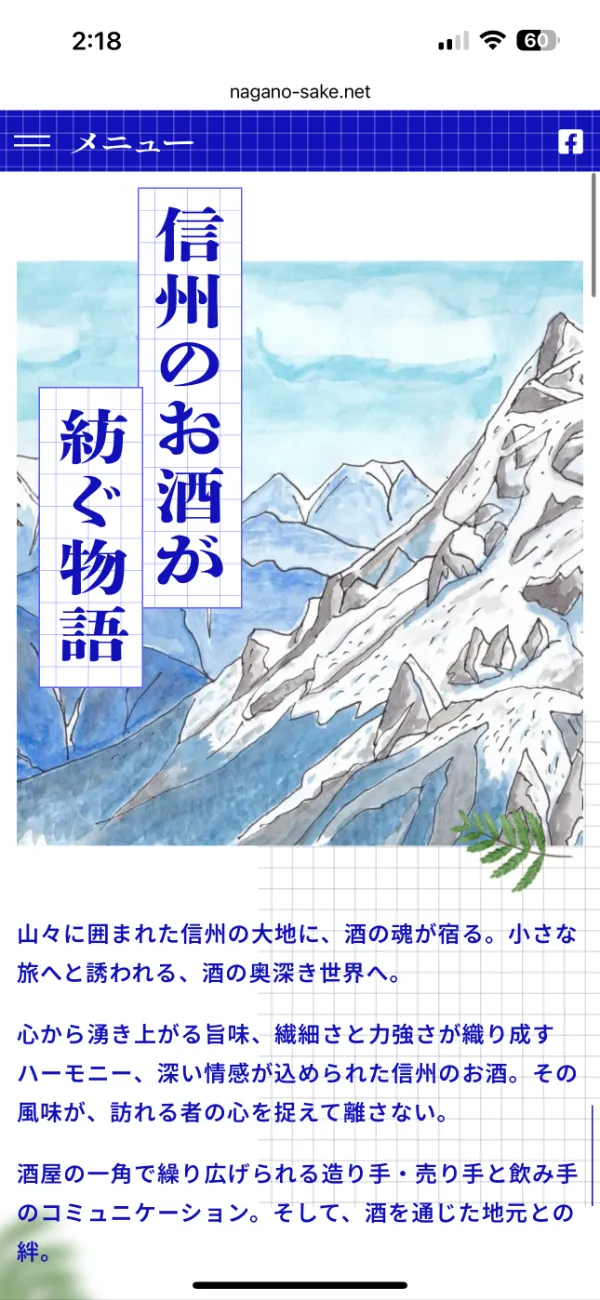
To match the concept of stories woven by Shinshu sake, the layout is built on a grid, and the typefaces were revised throughout to add an urban, light-footed feel.
A vivid blue inspired by the Alps became the theme colour for a pop impression, with illustrations adding a friendly feel that invites people to drop in at their local liquor store.
A logo was created for Sakaya Sanpo, and the top of the page was redesigned so the logo could sit in the header without losing the original design.