HOME — Works — SUPA BĀGĀ
SUPA BĀGĀ
Food & Drink ・ 2026

SUPA BĀGĀ

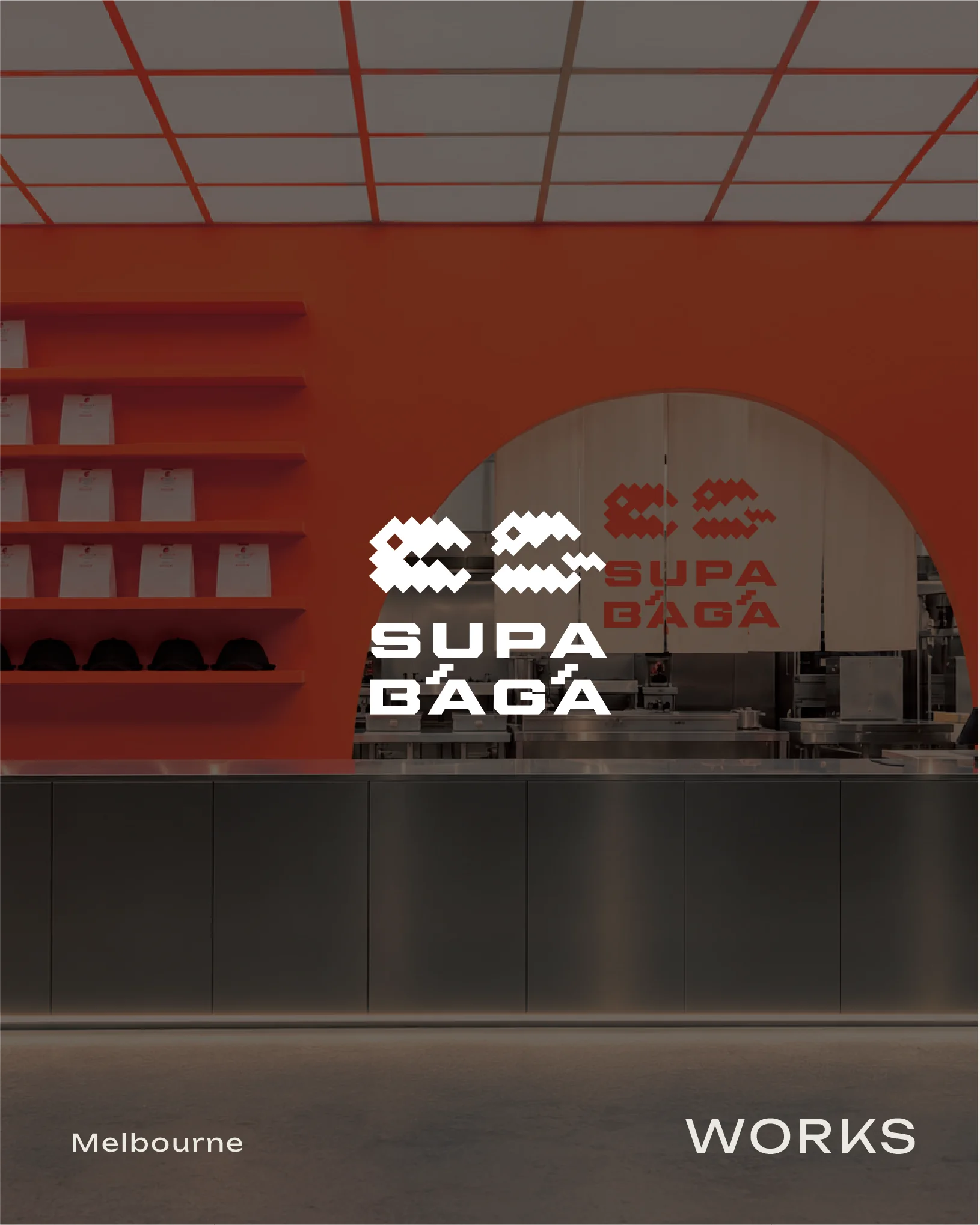
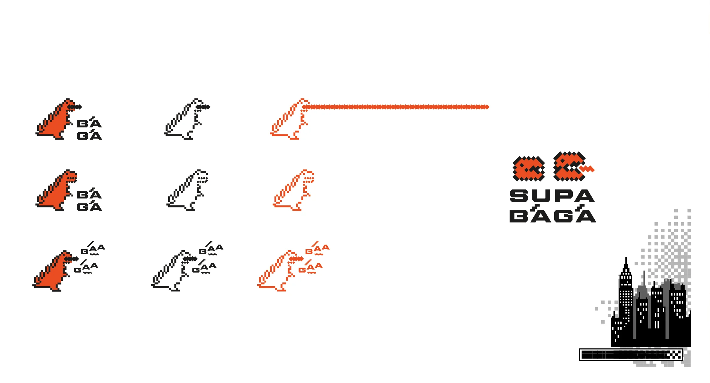
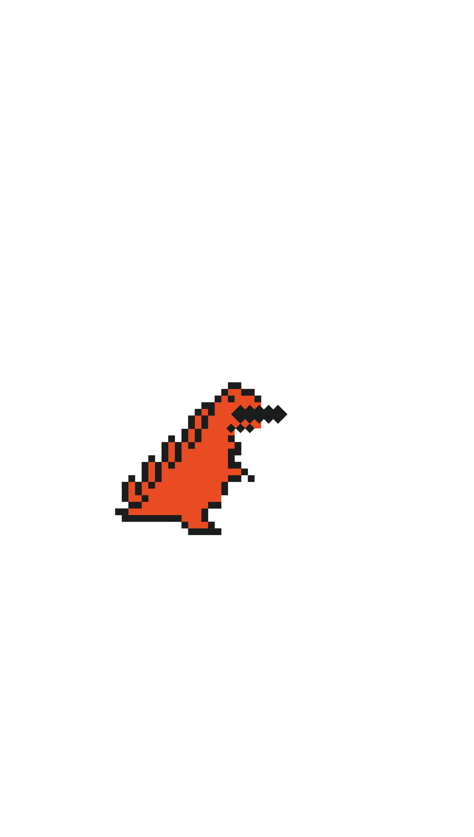
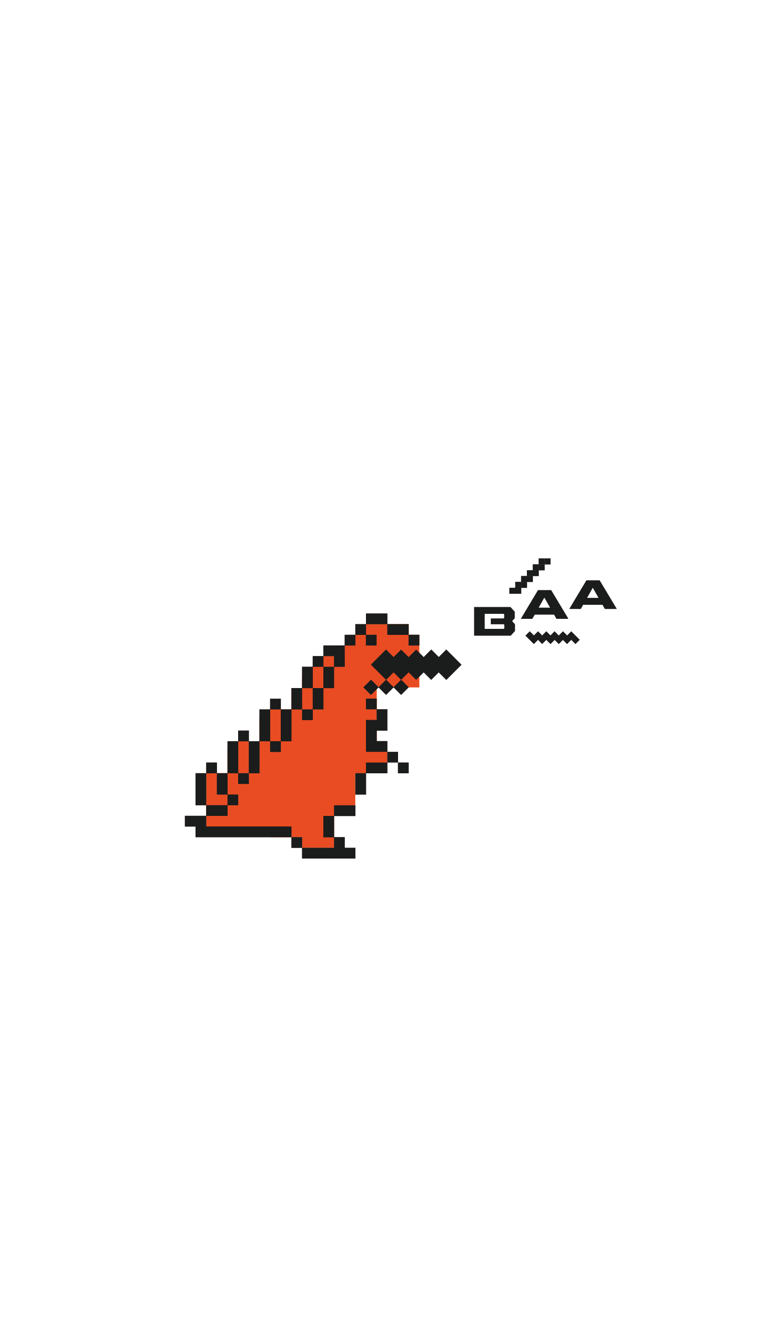
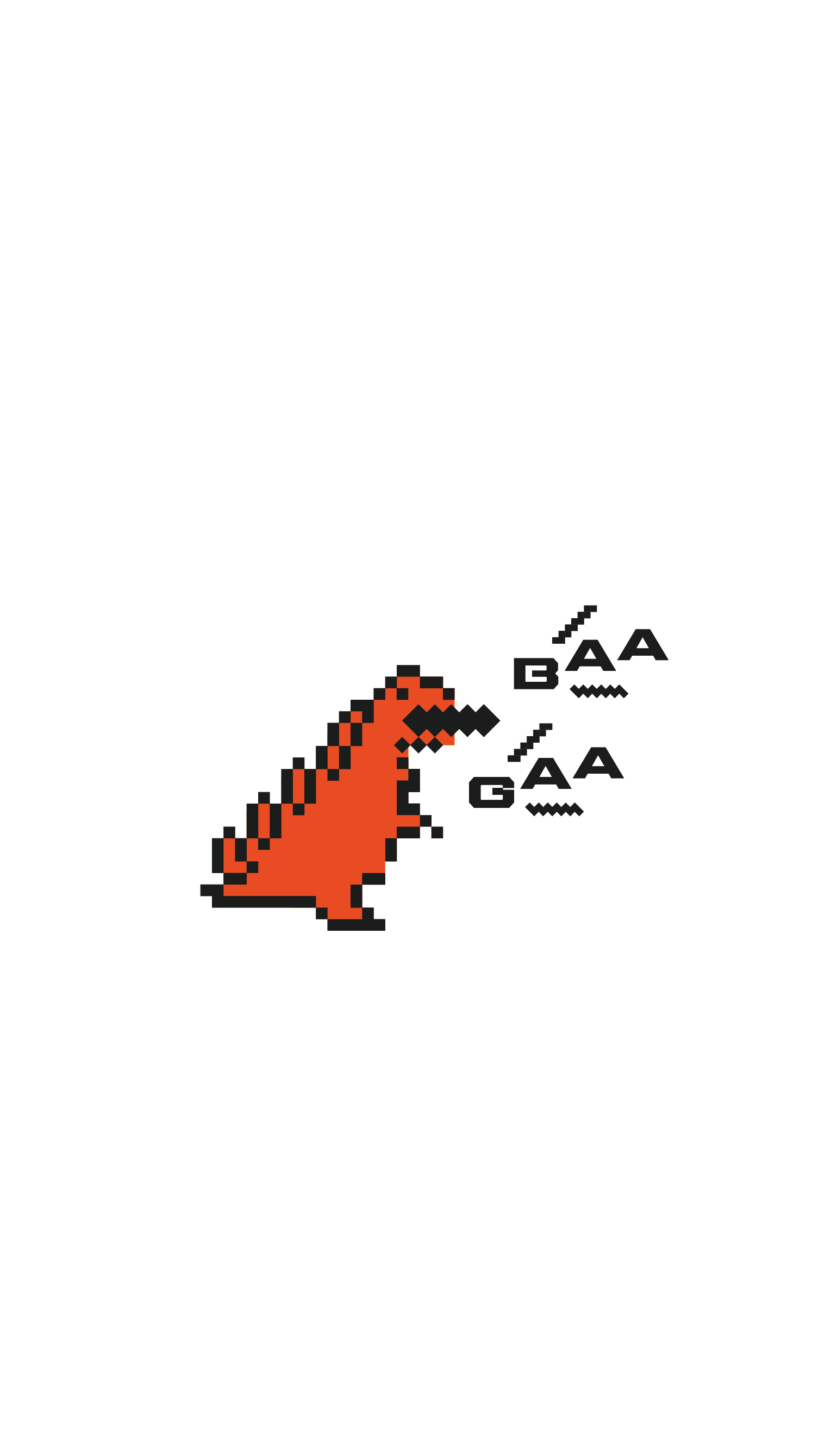
Brand design for SUPA BĀGĀ, a Japanese burger shop in Southbank, Melbourne. Rooted in 90s Japanese retro games and kaiju culture, the logo design features a pixel-art monster letting out a roar, “gā”, and the identity carries through to packaging and menu design.

BRANDING LOGO COLLATERAL MOTION GRAPHICS
CREDITS
Project Management / Brand Strategy :Richard Wu
Marketing Strategy :Roslyn Foo
Marketing Team :Glamorazzi
Chef & Culinary Consultant :Ryo Northfield
Branding / VI / Package / Menu :Moe Luick
GALLERY
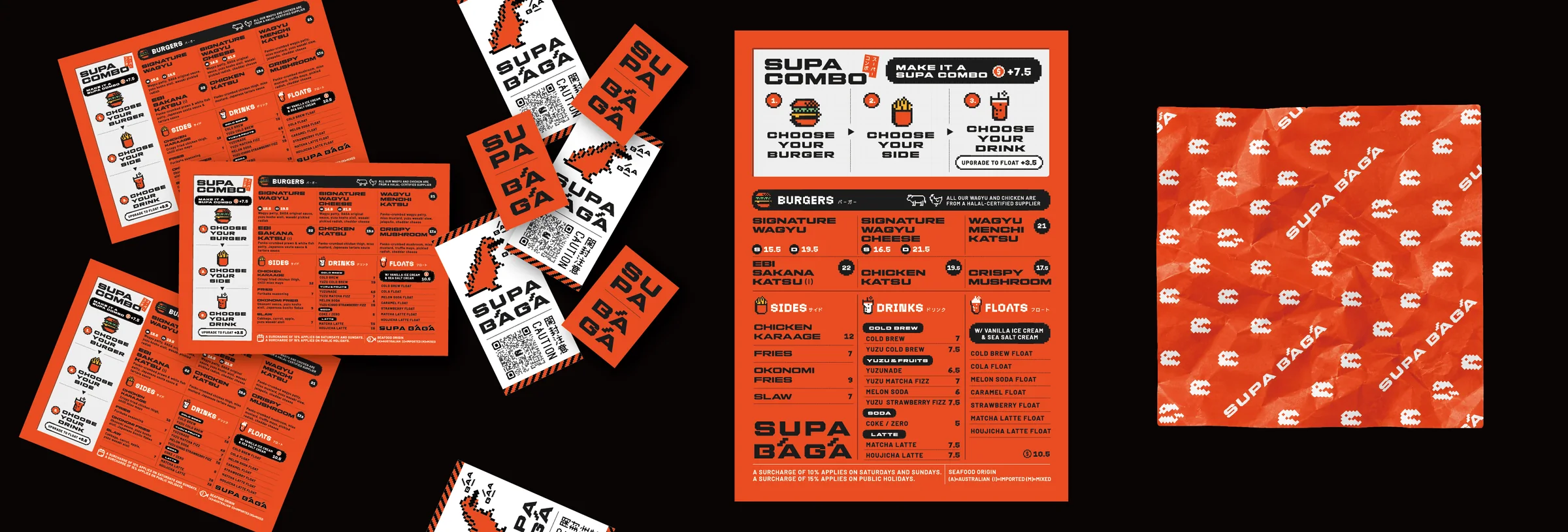
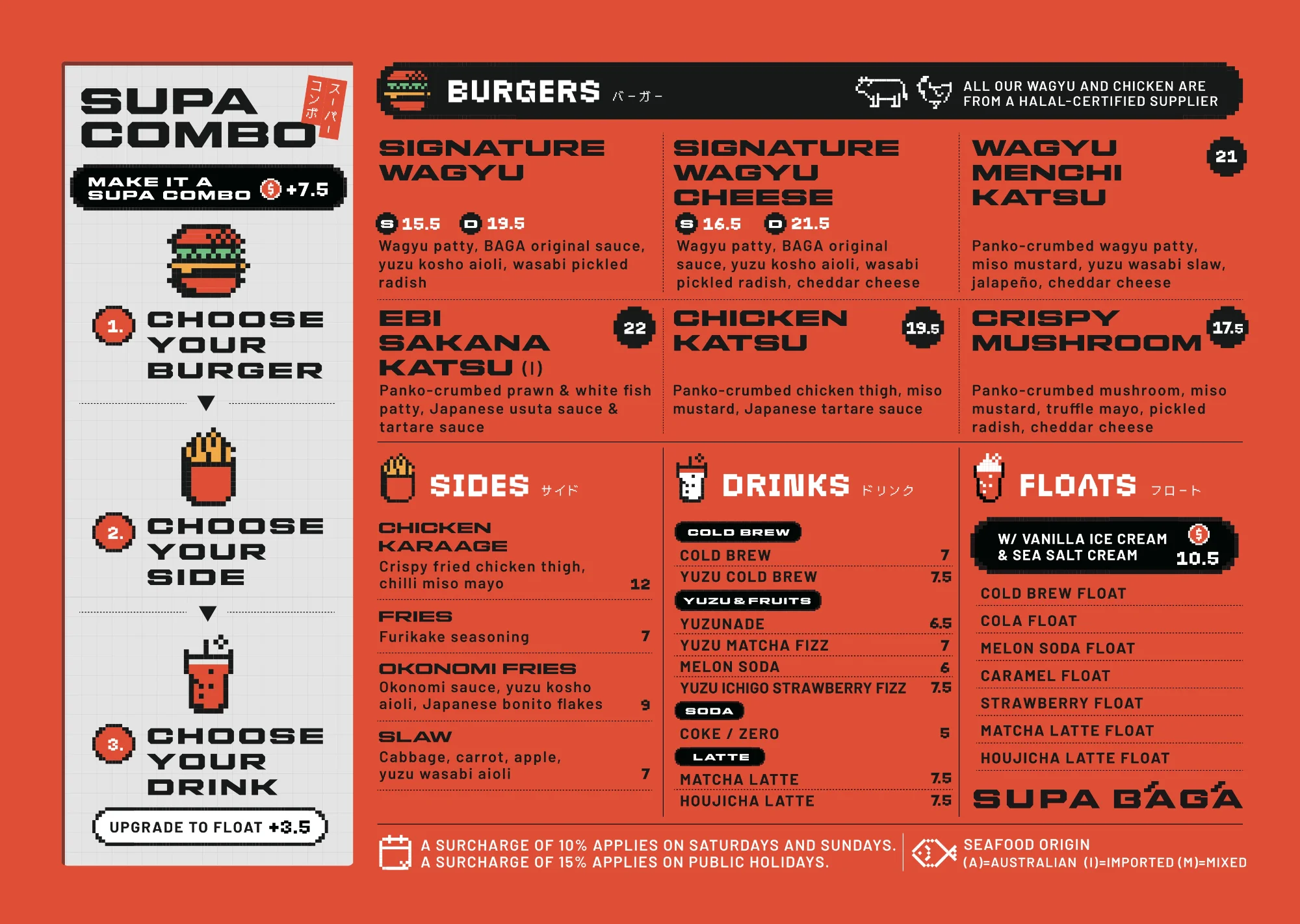
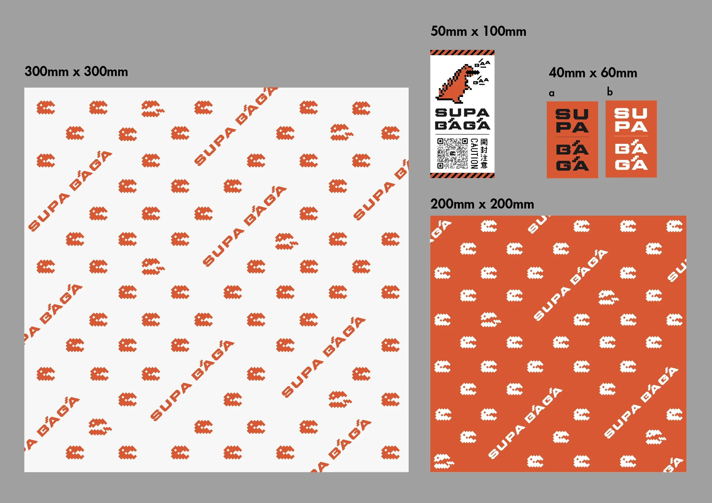
SUPA BĀGĀ menu, stickers and wrapping paper
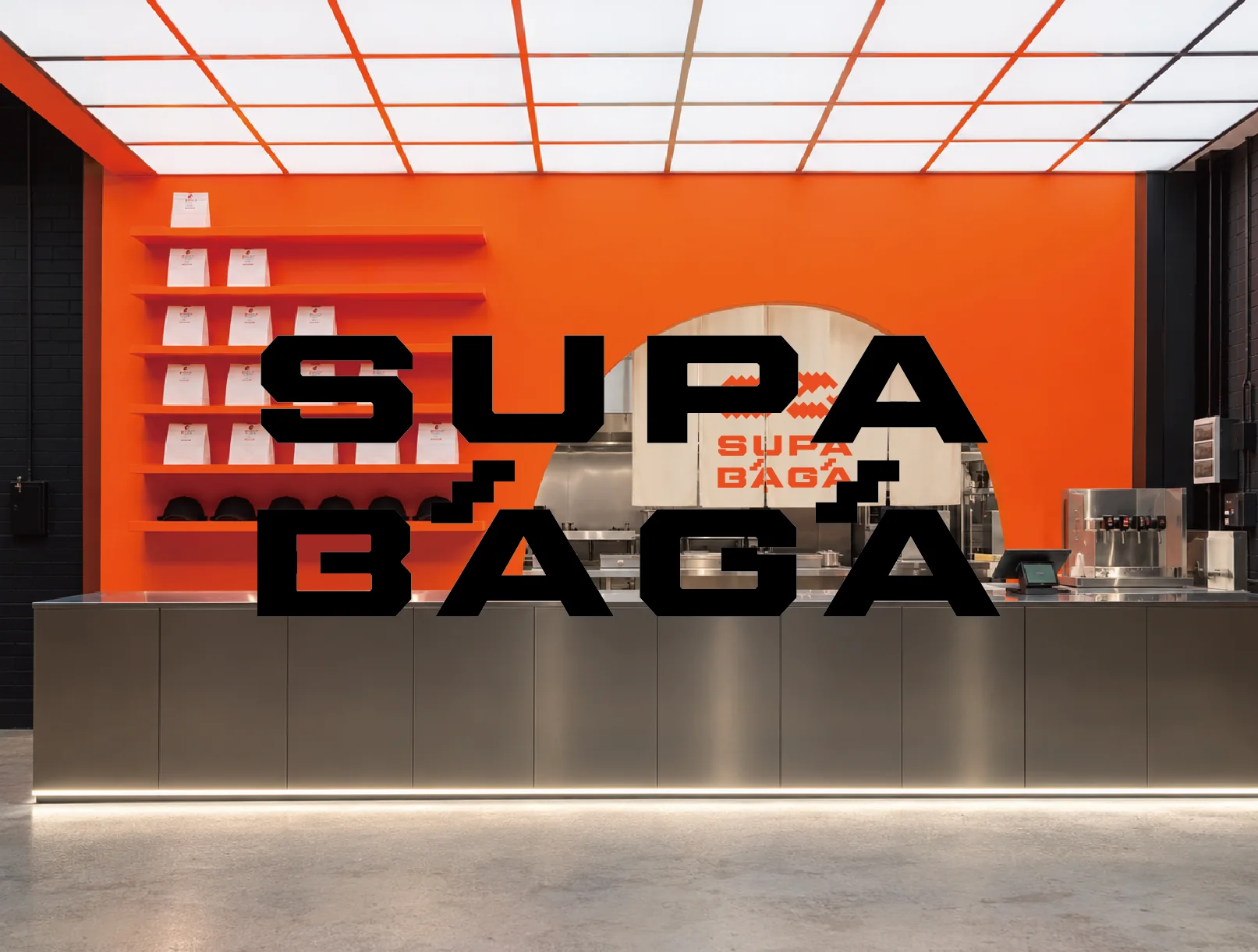
SUPA BĀGĀ logo proposal mockup in a shop setting
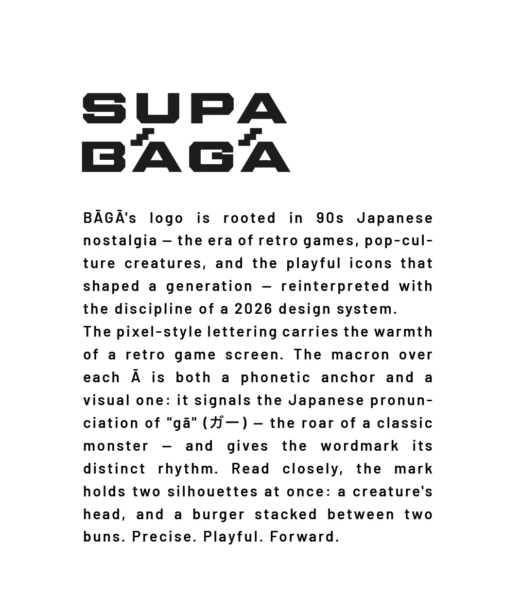
SUPA BĀGĀ logo story
SUPA BĀGĀ pixel monster icons and symbol variations
SUPA BĀGĀ menu design
SUPA BĀGĀ burger wrapping paper
SUPA BĀGĀ logo on orange
SUPA BĀGĀ logo on white
SUPA BĀGĀ wordmark
SUPA BĀGĀ pixel pattern
SUPA BĀGĀ pixel pattern in orange
SUPA BĀGĀ monster icon
SUPA BĀGĀ monster icon roaring
SUPA BĀGĀ monster icon double roar
SUPA BĀGĀ wrapping paper and seal sticker designs
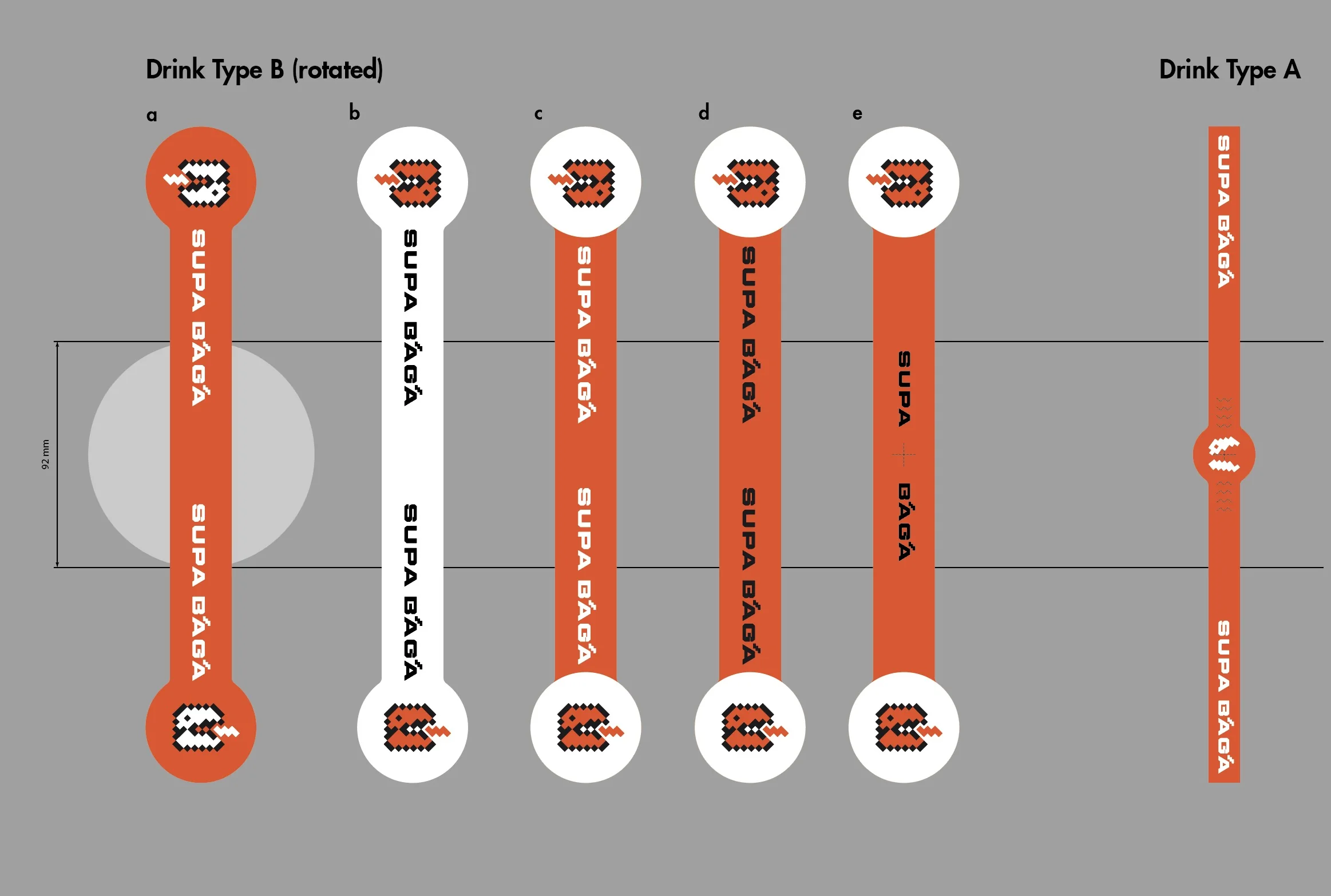
SUPA BĀGĀ drink sticker design options
ABOUT

About the client

A Japanese-style burger shop in Southbank, Melbourne. The menu turns Japanese flavours into burgers, such as wagyu, wagyu menchi katsu and ebi (prawn and fish) katsu, alongside karaage, okonomi fries, and matcha and yuzu drinks and floats. The food is overseen by Ryo Northfield, who is also a chef at Sara Craft Ramen & Bar.

STORY

A brand born from “I want to open a Japanese burger shop”

The project began with an idea from Ryo Northfield, who is also a chef at Sara Craft Ramen & Bar: to open a Japanese burger shop. Meetings with co-owner and brand strategist Richard Wu, together with the marketing strategy from Roslyn Foo, CEO of Glamorazzi, set the direction for the brand and its colours: sleek, simple and modern, with a Japanese soul.

SUPA BĀGĀ spells “super burger” the way it sounds in Japanese, and in Japanese a monster's roar is written “gā”. That shared sound became the core of the visual identity, a modern rebuild of 90s Japanese retro games and kaiju culture. The macron over each Ā doubles as the monster's roar and gives the wordmark its rhythm, while the mark holds two silhouettes at once: a creature's head and a burger.

Vivid orange with black and white makes a three-colour palette. Sleek, simple and Japanese without tipping into nostalgia, the identity carries through packaging, the menu and the shop's tools.

Send me an email or DM about your business and ideas or for fun collaboration.