IRUMU de CHOBIT is a chocolate bar that came out of Sweets Deco Irumu, a Type B continuous employment support workplace (shūrō keizoku shien B-gata, a Japanese welfare service offering supported work) in Sapporo. The whole project was coordinated by Kahoru Osumi of @BOTANICAL, as the food professional. Product development was led mainly by these two, and Tenth Of October took care of the branding and packaging design.
ConceptBrandingLogoPackagingCollateral
01 ・ TEAM
Two teams made the product.
IRUMU de CHOBIT is a project that brought together the people who make the product and a food professional. My part, as the designer, was the branding and the packaging.
PRODUCT ・ MAKING
Sweets Deco Irumu
A Type B continuous employment support workplace in Shiroishi Ward, Sapporo, run by the non-profit NPO Opea. They make baked doughnuts, biscuits and other sweets, and sell them locally, at events and online. IRUMU de CHOBIT is also made by hand by Irumu's participants and staff. Sweets Deco Irumu IRUMU de CHOBIT product page
PRODUCT DEVELOPMENT ・ COORDINATION
Kahoru Osumi (@BOTANICAL)
A culinary researcher and herb specialist, and the head of KINA, a herb and cooking salon in Sapporo. Through @BOTANICAL she develops recipes that make the most of herbs and regional produce, and supports promotional events and product development. On this project, as the food professional, she coordinated everything from choosing ingredients and designing the product to aligning everyone involved. @BOTANICAL KINA
02 ・ PRODUCT
"Guilt-free" through satisfaction, not fewer calories.
The "guilt-free" concept is not about cutting calories. The goal was a healthy bar that feels truly satisfying, thanks to its texture and good ingredients.
The depth of cacao, with the natural sweetness of liquorice grown by Hokkaido farmers. They chose Hokkaido ingredients such as local grains and pumpkin seeds, and kept refining the texture. Led by Osumi-san and Irumu, the product took shape one step at a time.
Taste × Health × Social value × Design
The four pillars that guided the branding
03 ・ BRANDING
Listen to what matters first, then shape the brand.
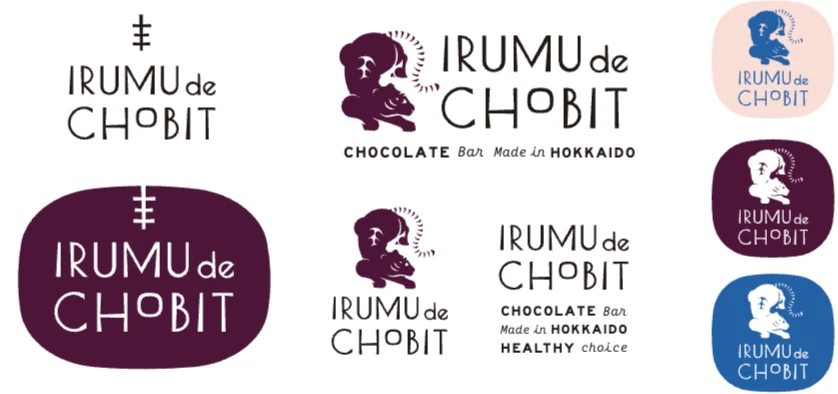
The tiger in the logo was created by one of Irumu's participants, and everyone there loves it. The tiger mark came from their feeling that "we really want to use this tiger".
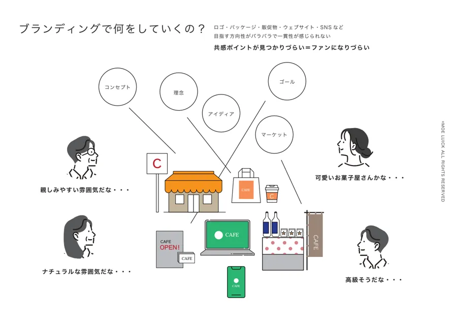
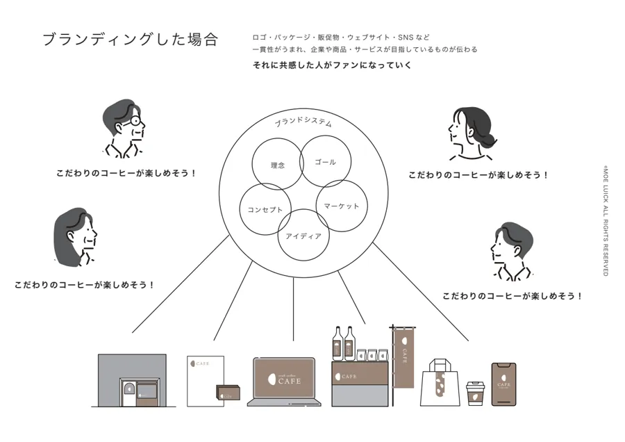
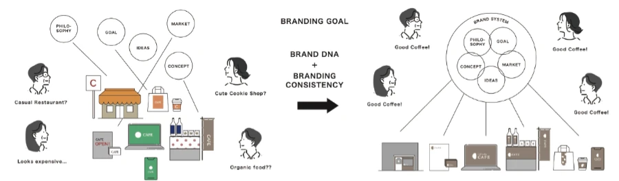
After hearing that, I started by sharing what branding actually is. If the logo, packaging and promotional materials all point in different directions, people take away different impressions. When everything is consistent, what you are aiming for comes across, and the people who connect with it become fans. That is the conversation we began with.
Part of the deck we used in our meetings: the difference between a product with and without branding.
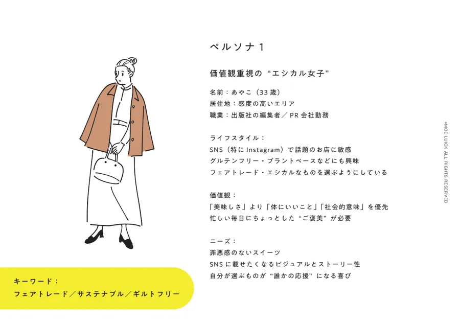
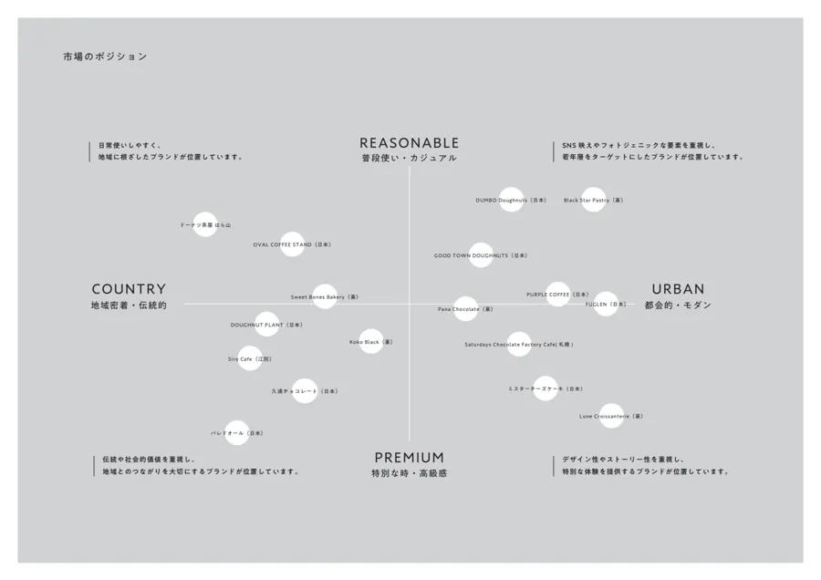
From there, we lined up brands in a similar position to think about where this one sits in the market, and talked about who we wanted to reach and how we wanted people to feel when they pick it up. People who care about wellbeing and social impact, and people who choose a product because they connect with the makers' story or the packaging. So that it would reach them as "a small everyday treat", we settled on the concept "Don't Sugarcoat It".
Working slides on the target customer and market positioning.
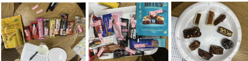
We held many workshops and tasting sessions, and defined the concept together.
04 ・ PACKAGE
Packaging the makers can handle with confidence.
What mattered most in the packaging was that Irumu's participants could do the work comfortably. Beyond the structure, such as how it folds and how it is filled, I also thought about the preparation needed to handle chocolate.
Whether it actually suited the work on the ground was checked again and again by Osumi-san, who was there in person, and Irumu's staff, through a lot of trial and error. It is thanks to the two of them that a design made from far away could become real.
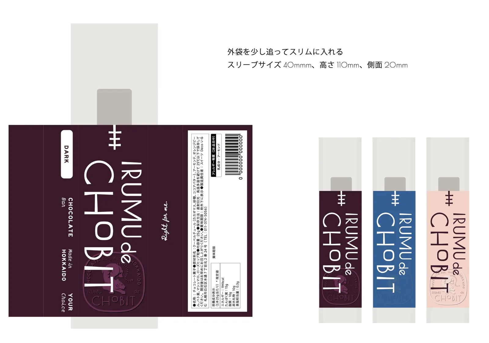
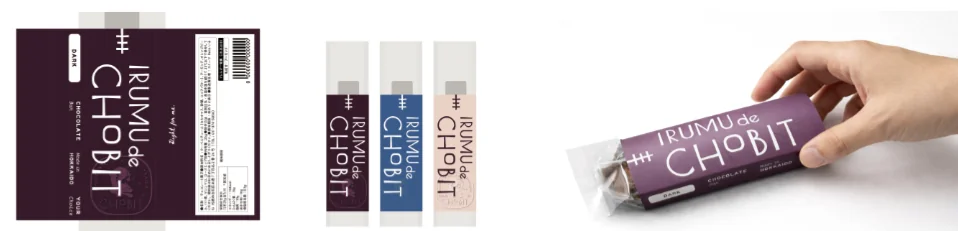
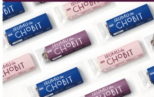
The format is a sleeve, with the inner wrapper folded slightly so it slides in slim. It measures 40mm wide, 110mm high and 20mm deep. I chose this shape with ease of packing in mind.
The sleeve dieline, with mock-ups in three colours.
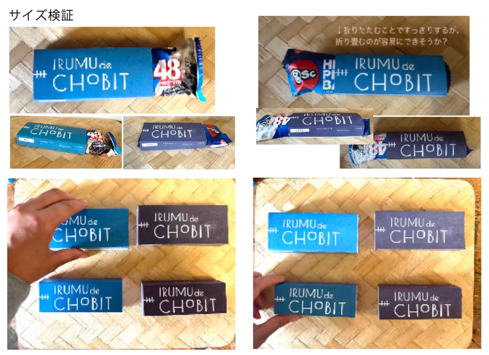
We slipped a prototype sleeve over a shop-bought bar to check the size. Folding the inner wrapper makes it look neater, so we also tested whether it could be folded easily as part of the packing process.
The size test, comparing the wrapper folded and unfolded.
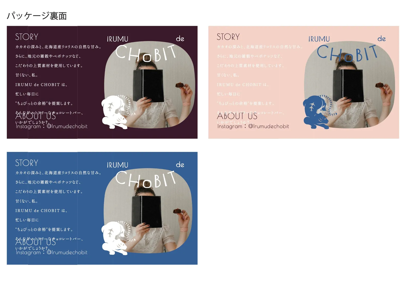
The back of the pack tells the product's story. I compared how each colour looked while working out the amount of text, the photos and where the tiger should sit.
Work-in-progress drafts for the back.
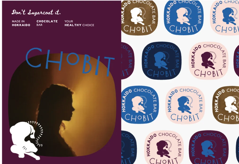
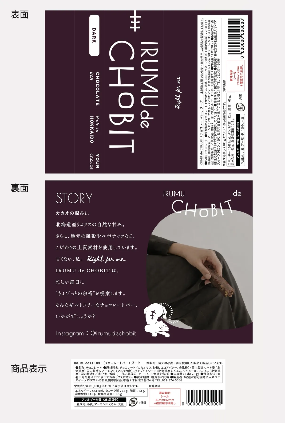
The front of the pack, the story on the back, and the product label.
IRUMU de CHOBIT is a chocolate bar that came out of Sweets Deco Irumu, a Type B continuous employment support workplace (shūrō keizoku shien B-gata, a Japanese welfare service offering supported work) in Sapporo. The whole project was coordinated by Kahoru Osumi of @BOTANICAL, as the food professional. Product development was led mainly by these two, and Tenth Of October took care of the branding and packaging design.
Concept
Branding
Logo
Packaging
Collateral
01 ・ TEAM
Two teams made the product.
IRUMU de CHOBIT is a project that brought together the people who make the product and a food professional. My part, as the designer, was the branding and the packaging.
PRODUCT ・ MAKING
Sweets Deco Irumu
A Type B continuous employment support workplace in Shiroishi Ward, Sapporo, run by the non-profit NPO Opea. They make baked doughnuts, biscuits and other sweets, and sell them locally, at events and online. IRUMU de CHOBIT is also made by hand by Irumu's participants and staff. Sweets Deco Irumu IRUMU de CHOBIT product page
PRODUCT DEVELOPMENT ・ COORDINATION
Kahoru Osumi (@BOTANICAL)
A culinary researcher and herb specialist, and the head of KINA, a herb and cooking salon in Sapporo. Through @BOTANICAL she develops recipes that make the most of herbs and regional produce, and supports promotional events and product development. On this project, as the food professional, she coordinated everything from choosing ingredients and designing the product to aligning everyone involved. @BOTANICAL KINA
02 ・ PRODUCT
"Guilt-free" through satisfaction, not fewer calories.
The "guilt-free" concept is not about cutting calories. The goal was a healthy bar that feels truly satisfying, thanks to its texture and good ingredients.
The depth of cacao, with the natural sweetness of liquorice grown by Hokkaido farmers. They chose Hokkaido ingredients such as local grains and pumpkin seeds, and kept refining the texture. Led by Osumi-san and Irumu, the product took shape one step at a time.
Taste × Health × Social value × Design
The four pillars that guided the branding
03 ・ BRANDING
Listen to what matters first, then shape the brand.
The tiger in the logo was created by one of Irumu's participants, and everyone there loves it. The tiger mark came from their feeling that "we really want to use this tiger".
After hearing that, I started by sharing what branding actually is. If the logo, packaging and promotional materials all point in different directions, people take away different impressions. When everything is consistent, what you are aiming for comes across, and the people who connect with it become fans. That is the conversation we began with.
Part of the deck we used in our meetings: the difference between a product with and without branding.
From there, we lined up brands in a similar position to think about where this one sits in the market, and talked about who we wanted to reach and how we wanted people to feel when they pick it up. People who care about wellbeing and social impact, and people who choose a product because they connect with the makers' story or the packaging. So that it would reach them as "a small everyday treat", we settled on the concept "Don't Sugarcoat It".
Working slides on the target customer and market positioning.
We held many workshops and tasting sessions, and defined the concept together.
04 ・ PACKAGE
Packaging the makers can handle with confidence.
What mattered most in the packaging was that Irumu's participants could do the work comfortably. Beyond the structure, such as how it folds and how it is filled, I also thought about the preparation needed to handle chocolate.
Whether it actually suited the work on the ground was checked again and again by Osumi-san, who was there in person, and Irumu's staff, through a lot of trial and error. It is thanks to the two of them that a design made from far away could become real.
The format is a sleeve, with the inner wrapper folded slightly so it slides in slim. It measures 40mm wide, 110mm high and 20mm deep. I chose this shape with ease of packing in mind.
The sleeve dieline, with mock-ups in three colours.
We slipped a prototype sleeve over a shop-bought bar to check the size. Folding the inner wrapper makes it look neater, so we also tested whether it could be folded easily as part of the packing process.
The size test, comparing the wrapper folded and unfolded.
The back of the pack tells the product's story. I compared how each colour looked while working out the amount of text, the photos and where the tiger should sit.
Work-in-progress drafts for the back.
The front of the pack, the story on the back, and the product label.