HOME — JOURNAL — The making of SUPA BĀGĀ
PROCESS 2026.10.23 ・ Branding

The making of SUPA BĀGĀ.
A logo born from "burger" and a kaiju's "GĀ"

SUPA BĀGĀ is a Japanese burger shop that has opened in Southbank, Melbourne. How did its logo, a pixel-art kaiju (Japanese monster) roaring "GĀ", come about? In this post I look back on the whole journey: from the early idea, to settling the direction as a team, choosing the logo from three options and rolling it out across the shop, including the ideas that didn't make the cut.

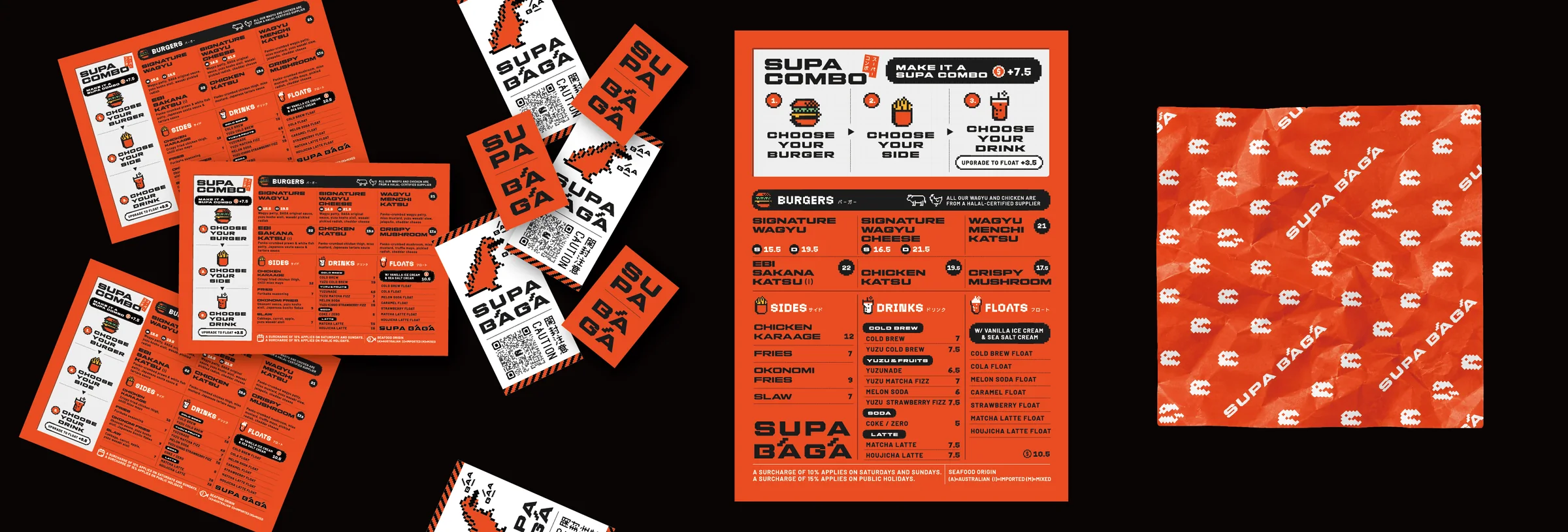
SUPA BĀGĀ menu, stickers and burger wrap
Menu, seal stickers and burger wrap. The vivid orange and the pixel kaiju carry across every piece of the shop.
01 ・ START

It started with one line: "I want to open a Japanese burger shop."

The project began with an idea from Ryo Northfield, who is also the chef at Sara Craft Ramen & Bar: "I want to open a Japanese burger shop." When I heard about this dream he had held onto for years, I remember being really drawn to the idea of creating a place in this city where people could enjoy a Japanese-style burger.

In the early stages, the concept was still fluid. In meetings with Richard Wu, brand strategist and co-owner, we explored a wide range of possibilities, from sharing a space with a wellness studio to combining matcha and wellness.

02 ・ STRATEGY

Strategy shaped the outline of the brand.

Then Roslyn Foo, CEO of Glamorazzi and a marketing strategist, came on board with a marketing strategy, and that set both the direction of the brand and the direction of its colours.

What the whole team agreed on was a brand that felt sleek, simple and modern, yet carried a Japanese soul. It could bring in a retro 90s mood, but without becoming too nostalgic, and it had to stand clearly apart from an American diner.

03 ・ IDEA

"Burger", and the kaiju's "GĀ".

As one direction, I wondered whether we could rebuild the world of retro video games in a modern way, and I started sketching.

During one meeting, I noticed an overlap in the sounds. SUPA BĀGĀ is how "super burger" sounds in Japanese pronunciation (sūpā bāgā). And in Japanese, a kaiju's roar is written as "gā gā" or "gaō". This sound could work as the core, the DNA, of the visual identity. I still remember how exciting it felt when that clicked.

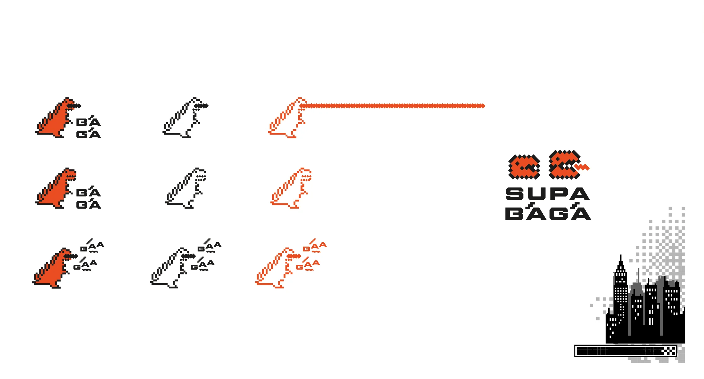
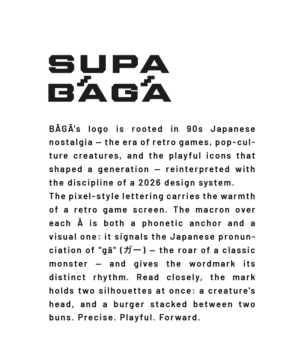
The macron over the Ā marks the long vowel in the Japanese pronunciation, and at the same time it is the kaiju's roar. Look closely at the mark and you will see two silhouettes overlapping: the kaiju's head, and a burger sandwiched between its buns.

SUPA BĀGĀ pixel-art kaiju icons and symbol variations
SUPA BĀGĀ logo story
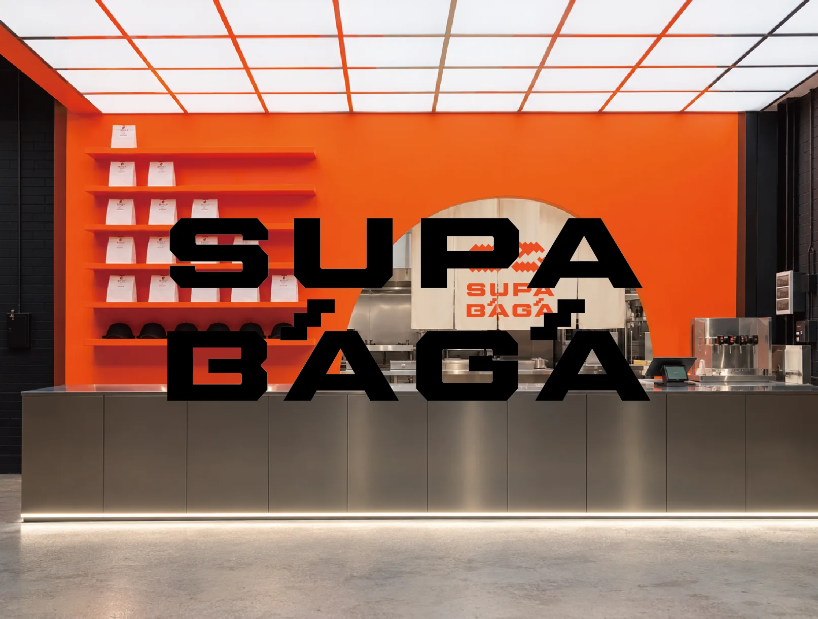
SUPA BĀGĀ shop mock-up from the logo presentation
04 ・ THREE DIRECTIONS

Three logo directions, and exploring colour.

For the first presentation, I prepared three logo options, each with a different direction. I also explored colour beyond orange, looking at blue and red as well.

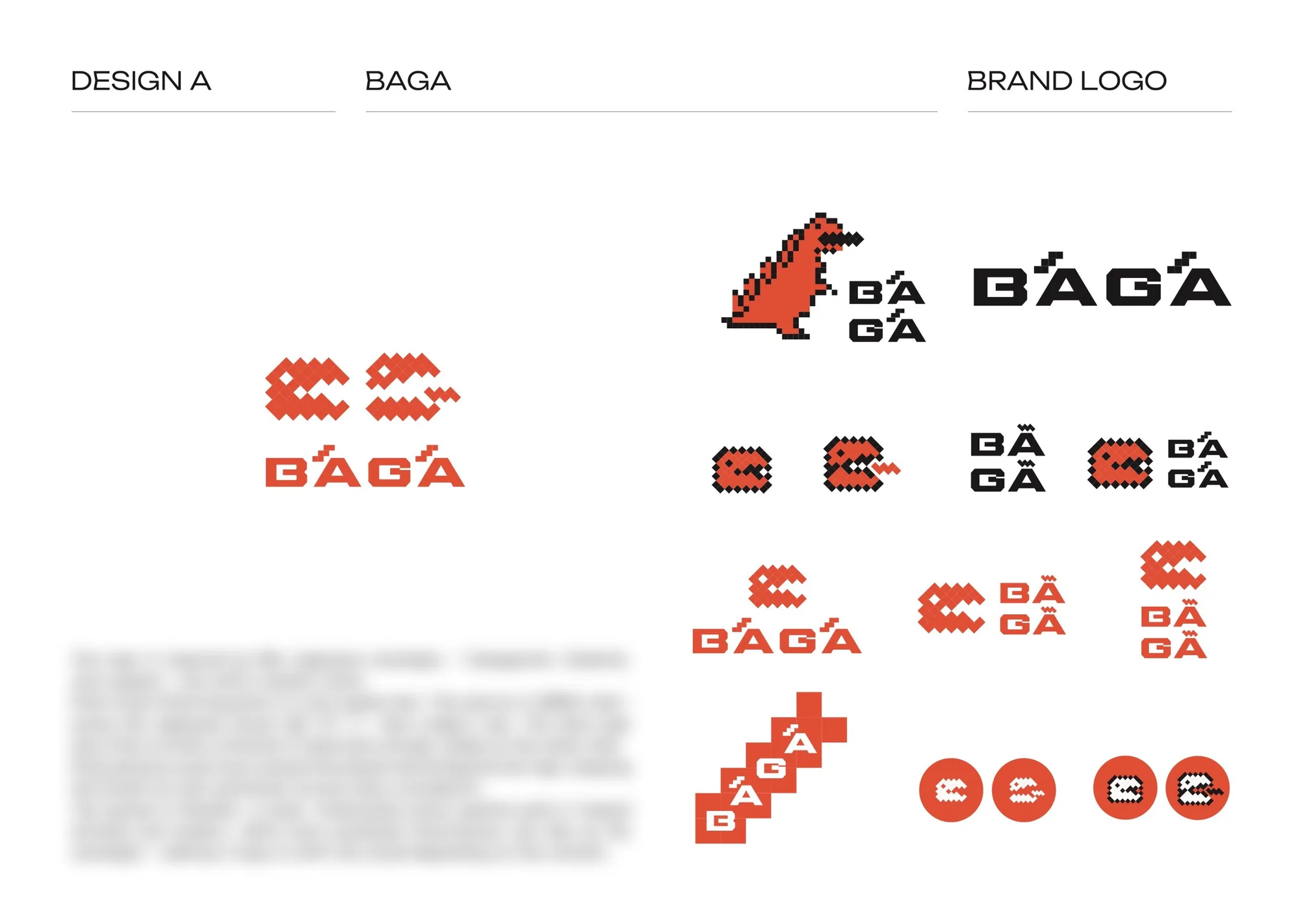
Design A (orange): a modern take on 90s Japanese nostalgia, retro video games and kaiju. Pixel lettering and the macron express the "GĀ", and pixel patterns and icons expand the world around it.

SUPA BĀGĀ logo option Design A (the chosen design)
Design A. The pixel logo that was eventually chosen.

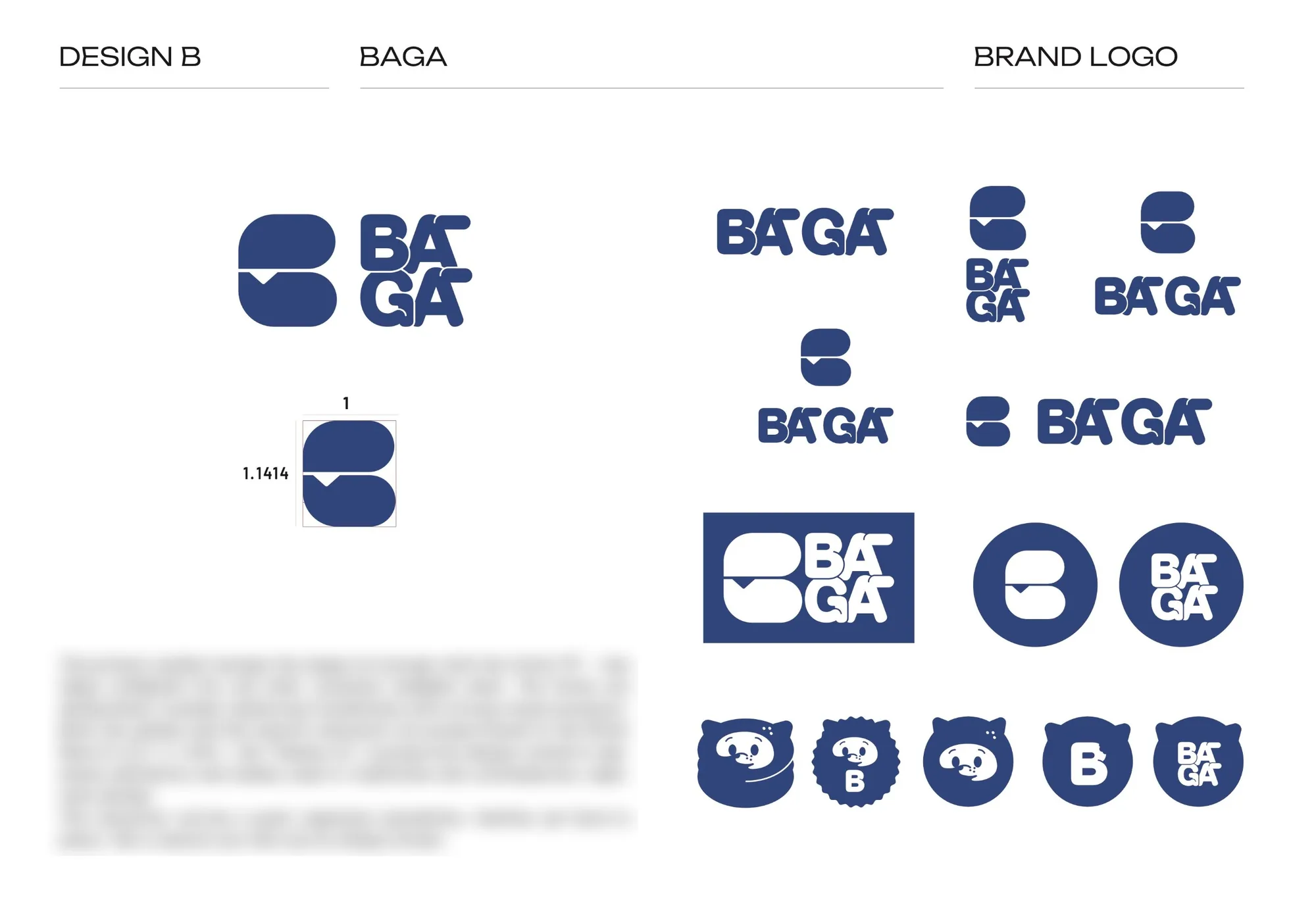
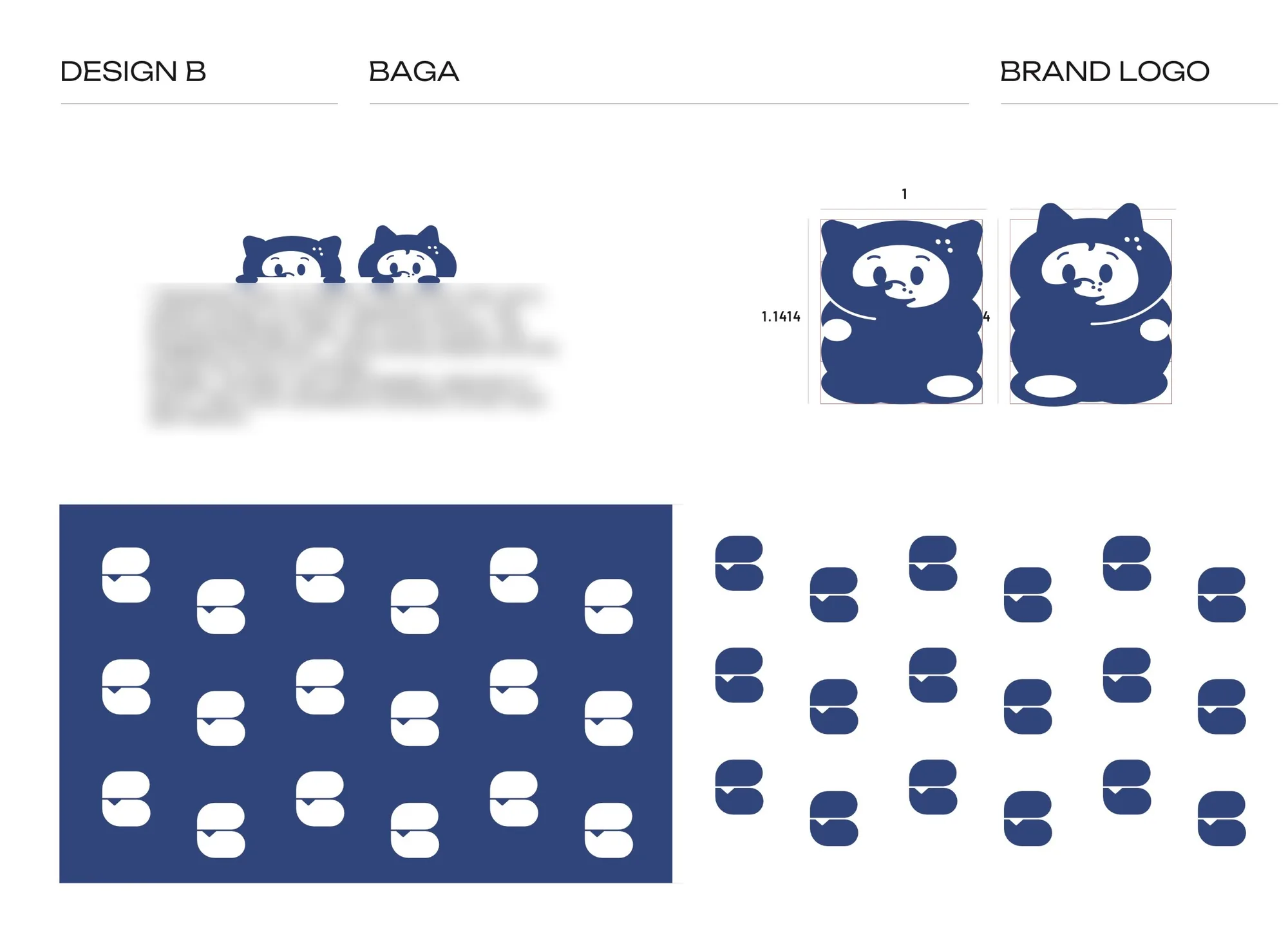
Design B (blue): a pair of mascots with a hint of motifs long loved in Japan, like the maneki-neko (beckoning cat) and the tanuki. The symbol combines the shape of a burger with the initial "B", and both the symbol and the mascots are proportioned using the silver ratio (1:√2), known in Japan as the yamato-hi ("Yamato ratio").

SUPA BĀGĀ logo option Design B (symbol and logo)
SUPA BĀGĀ logo option Design B (mascots and pattern)

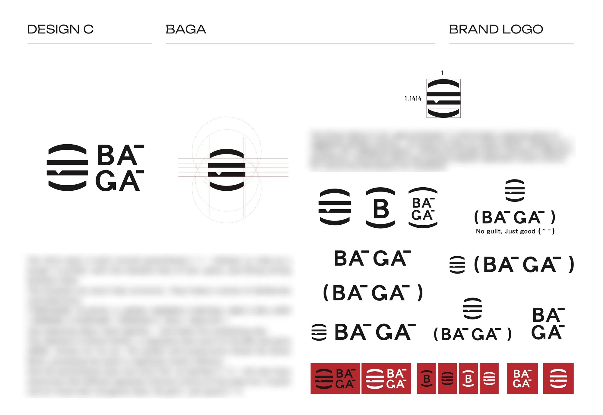
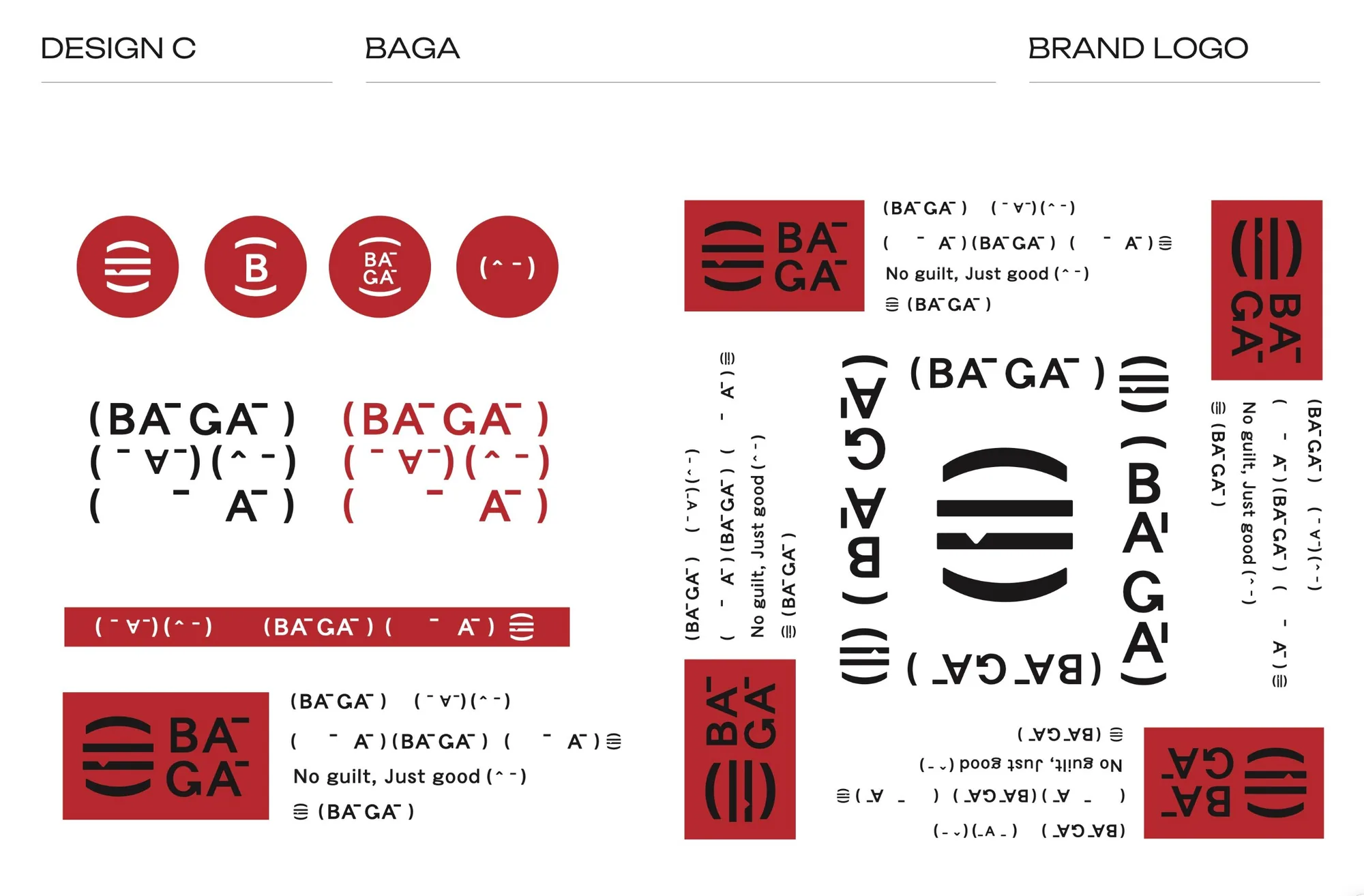
Design C (red): an idea that treats a pair of round brackets "( )" as a burger seen from the side. Inside the brackets sits the idea of combining two opposites, such as "Japan × burger", "matcha × bar" or "90s J-pop × modern". The typeface is a Heisei-era gothic (sans serif) from the 90s to the early 2000s, and the proportions follow the silver ratio. The brackets also become a kaomoji (^-^), the text emoticon that symbolises Japanese internet culture of the same era.

SUPA BĀGĀ logo option Design C (logo and symbol)
SUPA BĀGĀ logo option Design C (kaomoji and packaging)

For the presentation, I also prepared mock-ups placing the logo in a sleek space with a stainless steel counter. For a food business, vivid orange stirs the appetite, and it looks great against stainless steel and a sleek interior. After weighing up blue and red as well, the team unanimously came back to orange, and the first option, the pixel logo, was chosen.

05 ・ ROLLOUT

From the logo to the whole shop.

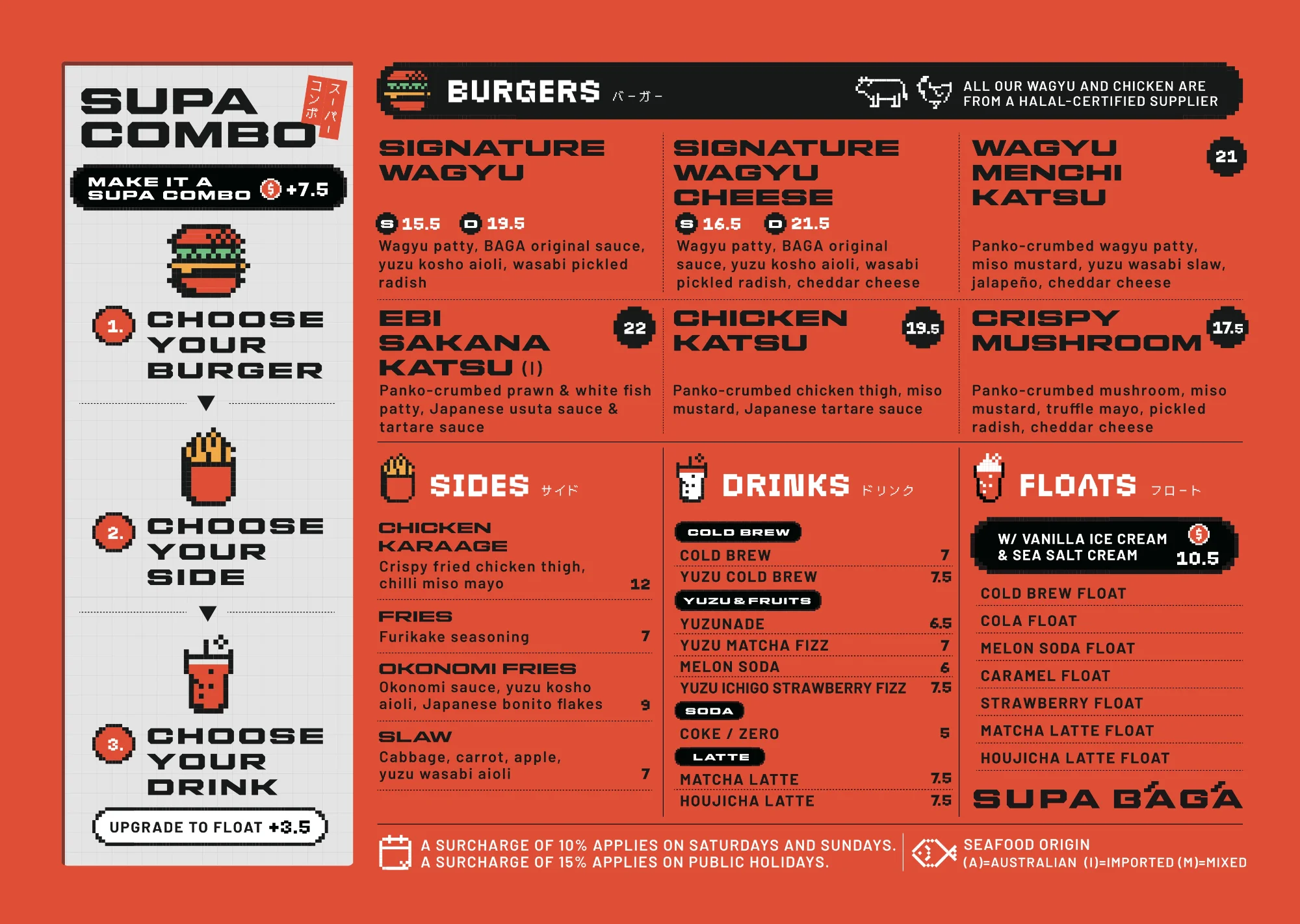
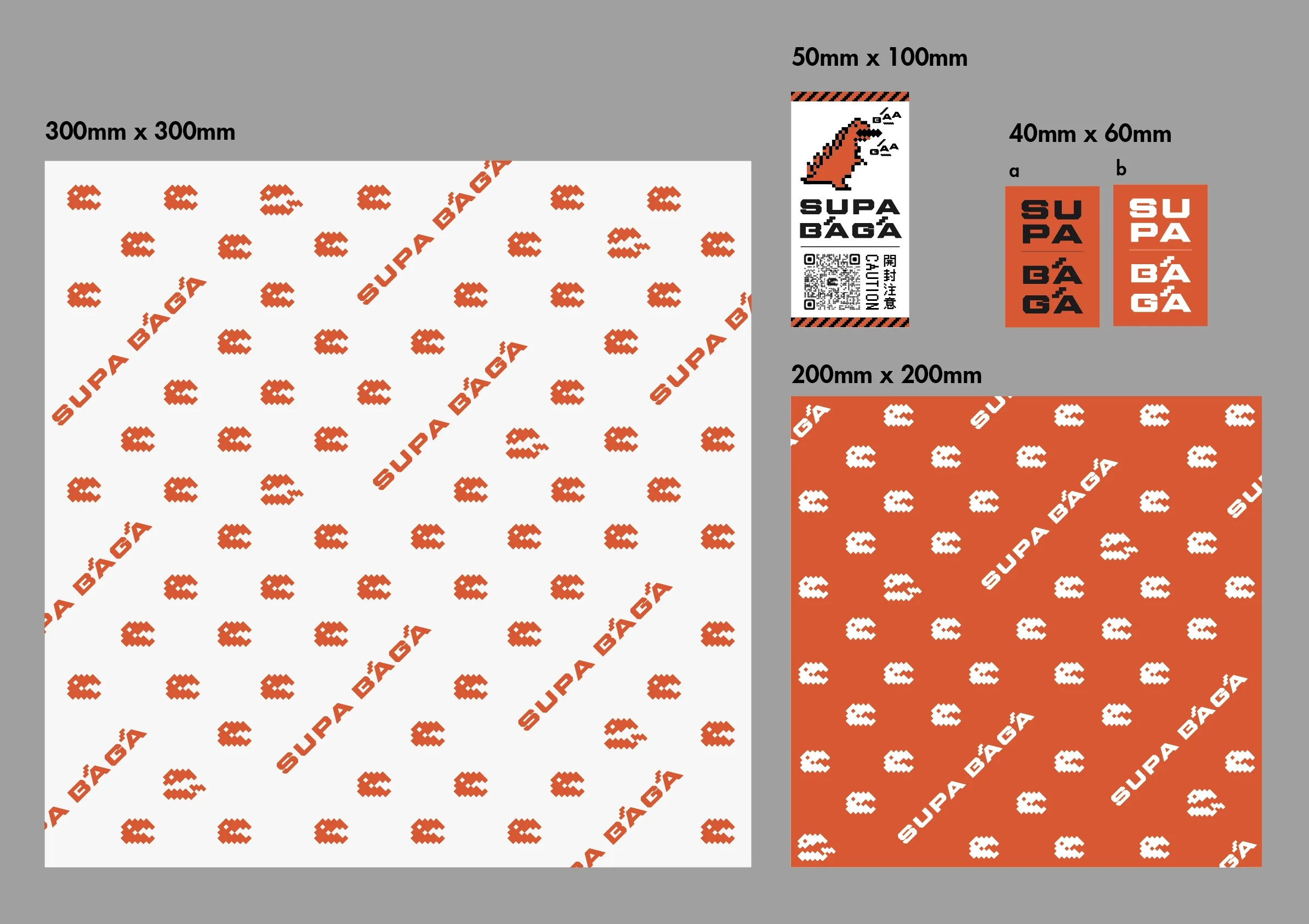
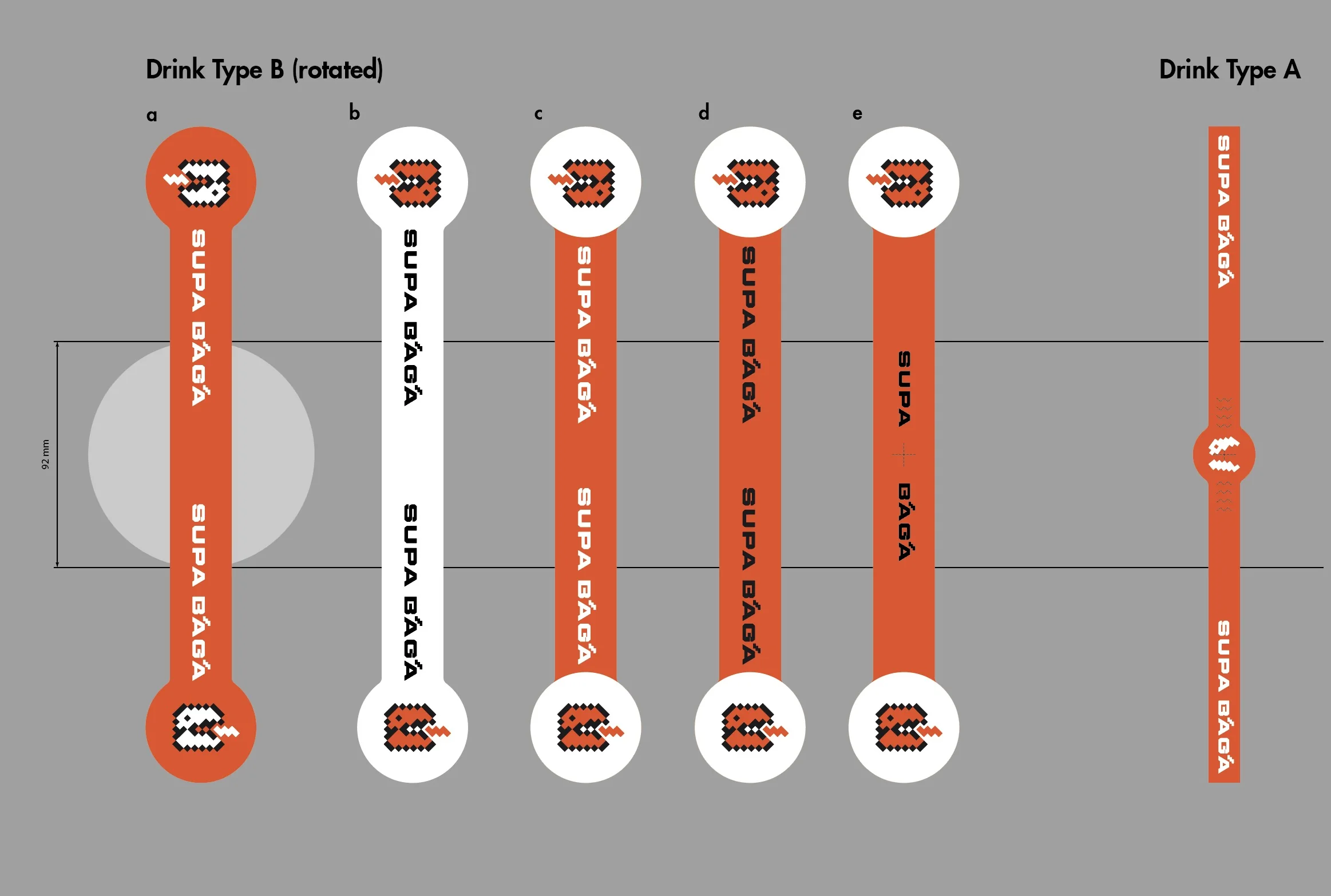
I developed pixel patterns and sub-icons, and rolled out one consistent world across the menu, burger wraps, seal stickers, drink stickers, paper bags, cup carriers and even the staff T-shirts.

It is a system that can be dialled up or down depending on the situation: clean for everyday use, with more pixel art and texture to lean into nostalgia for campaigns and social media.

SUPA BĀGĀ menu design
SUPA BĀGĀ burger wrap and seal sticker design
SUPA BĀGĀ drink sticker design concept
06 ・ BRAND GUIDE

Delivered as an online brand guide.

I delivered an online brand guide that brings together the logo, colours, typefaces and usage rules. Along with logo file downloads, it includes prompts to keep things on brand when creating with AI. The aim is for everyone on the team to keep using the brand by the same rules.

07 ・ TEAM

A brand built by a team.

This project was a team effort. In October 2026, the shop was also featured in the Melbourne publication Broadsheet Melbourne.

Nothing makes me happier right now than seeing the vivid orange and the pixel kaiju come to life across the shop and on social media.

CREDITS
Project Management / Brand Strategy : Richard Wu
Marketing Strategy : Roslyn Foo
Marketing Team : Glamorazzi
Chef & Culinary Consultant : Ryo Northfield
Branding / VI / Package / Menu : Moe Luick (Tenth Of October)
RELATED WORK SUPA BĀGĀ project page

See the gallery of the finished logo, packaging and menu.

View the project →
FREE CONSULTATION Opening a restaurant or café? Let's talk about your brand.

Tell us about your business, in English or Japanese. A link or a few photos is a fine place to start. No pressure.

Get in touch →

Send me an email or DM about your business and ideas or for fun collaboration.

フォームやメール、LINEからお気軽にご相談ください。

オーストラリアで活動されている様々な分野の方からのメッセージやコラボレーションの企画もウェルカムです!